Destiny 2 HUD
Improving visual clarity through HUD hierarchy
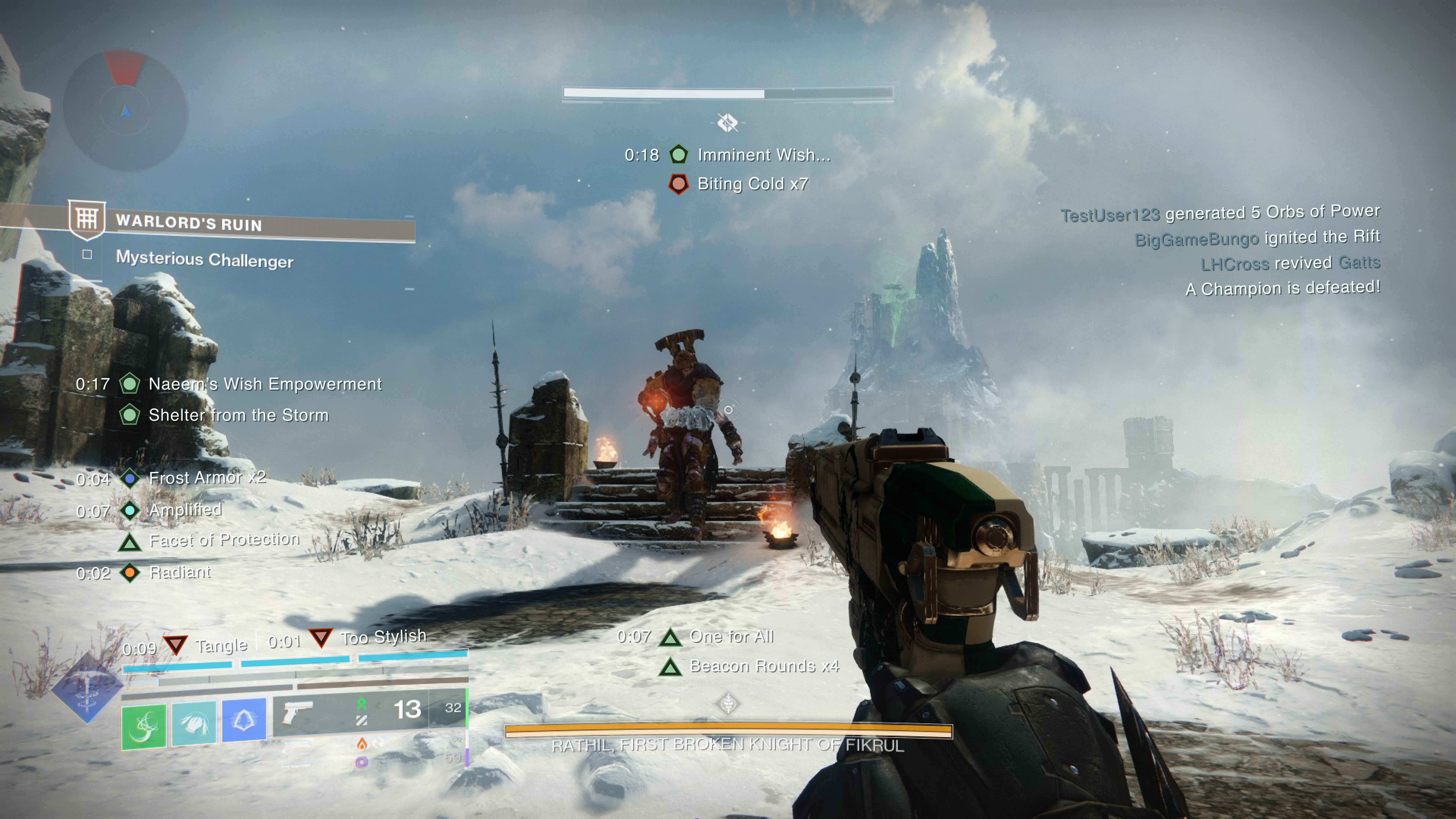
Over the past decade, Bungie's Destiny franchise has solidified its place as one of the greatest online multiplayer games. A significant part of its success comes from a captivating story, complemented by an evolving gameplay loop that keeps players engaged and coming back for more.
However, over the years since its genesis, one aspect that has always lagged behind was the UI. Now, with gameplay being more engaging than ever, it’s time for a display that can keep up with the information available.
[ROLE]
Product design
[TEAM]
Independent study
[TIMELINE]
2 weeks
[SKILLS]
Info. architecture
Visual design
User research
[CONTEXT]
The 500:1 ratio
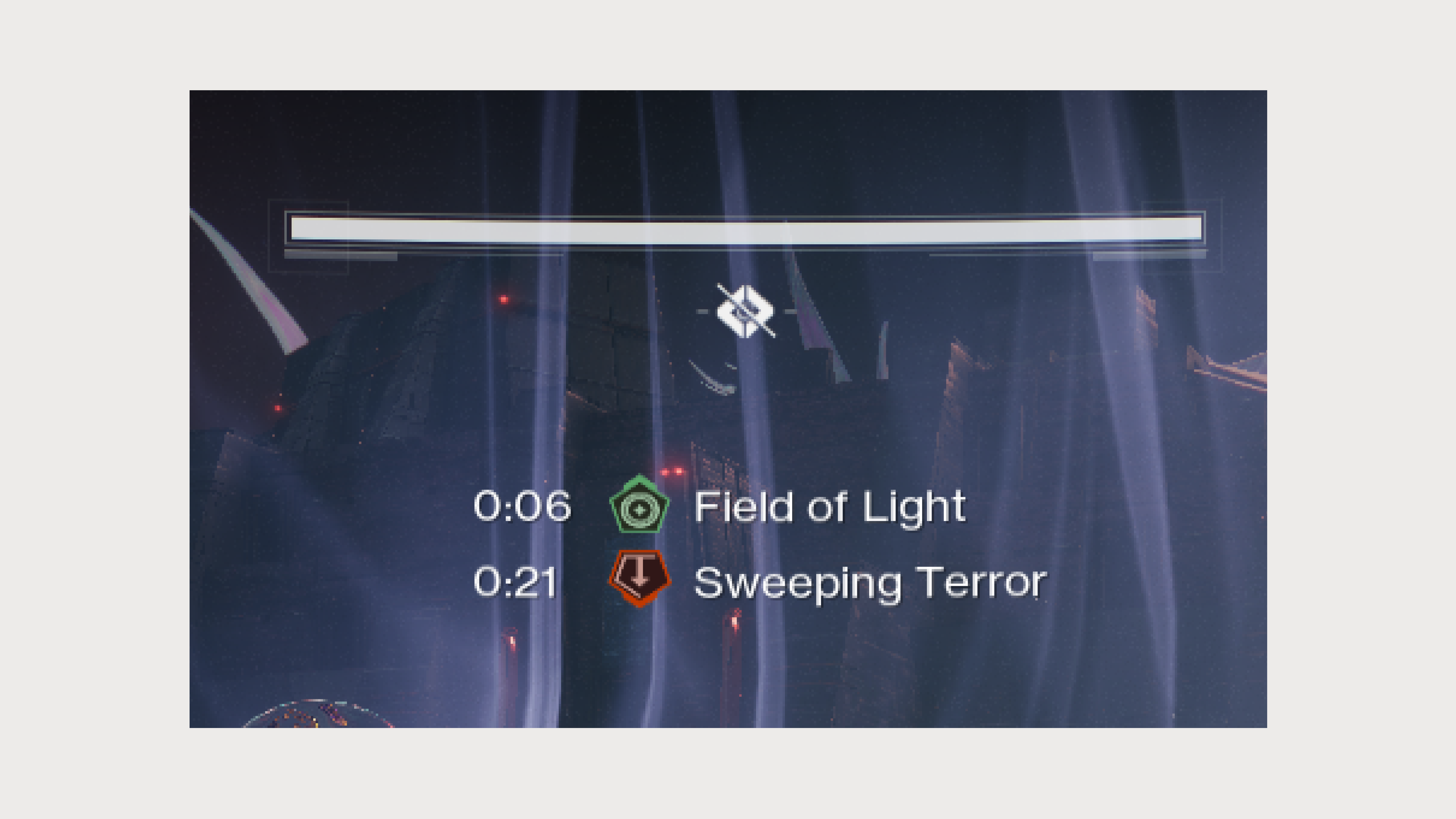
Prior to their most recent annual expansion, “The Final Shape” (TFS), Bungie teased major changes to the game’s heads-up display (HUD). They acknowledged that with over 2000 player-facing modifiers in the game, having only 4 slots available to display them on-screen was insufficient for effective gameplay communication.
“Important buffs were continually being pushed off the screen…we were asking players to constantly juggle a lot of information in their head.”
Bungie's comments on the HUD from their blog
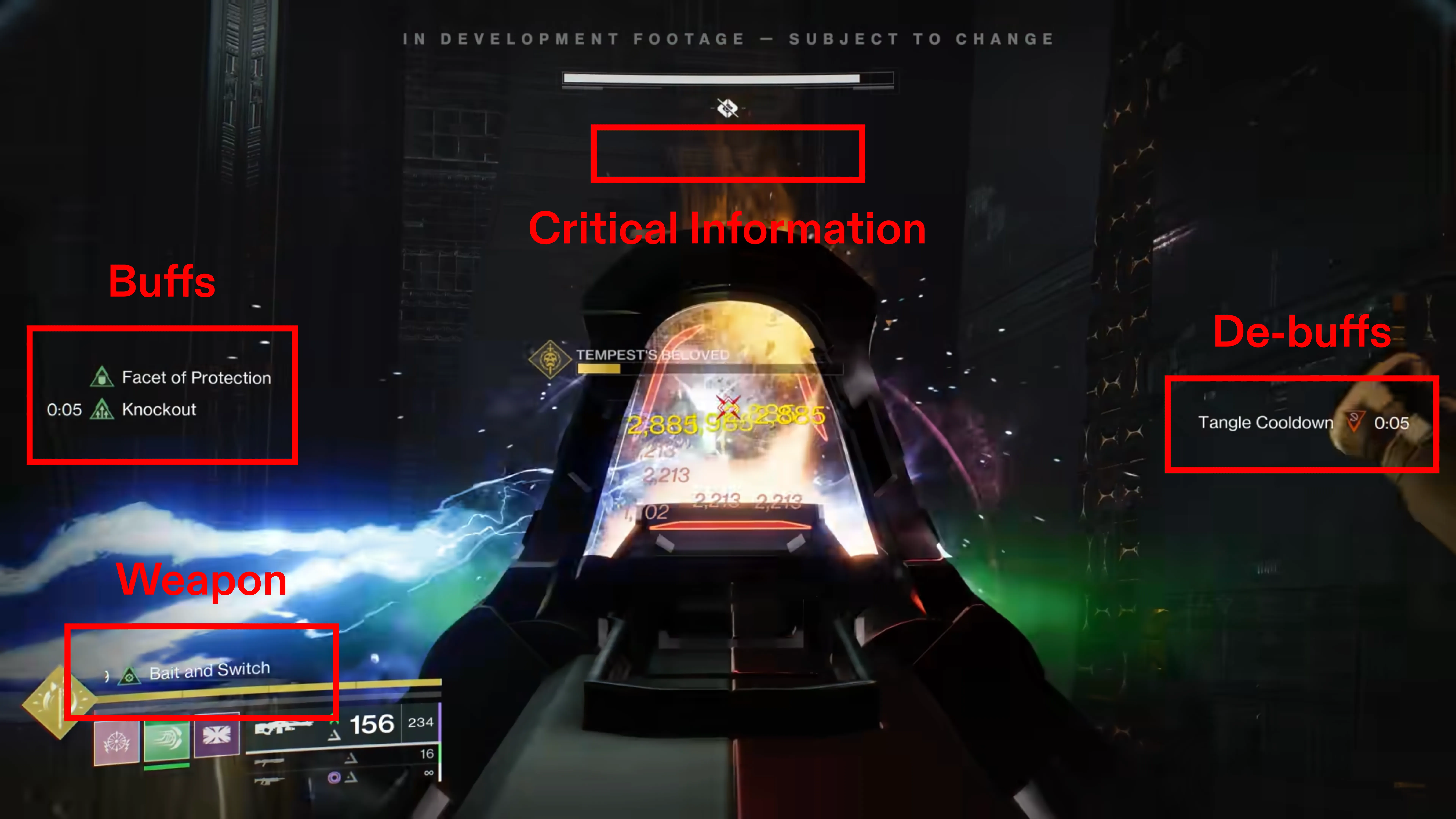
They previewed their proposed solution, modifier channels, which grouped like-modifiers into designated areas (channels) on the screen.
These channels were named:
Critical Information
Weapon
Buffs
De-buffs
Modifier channels in gameplay preview
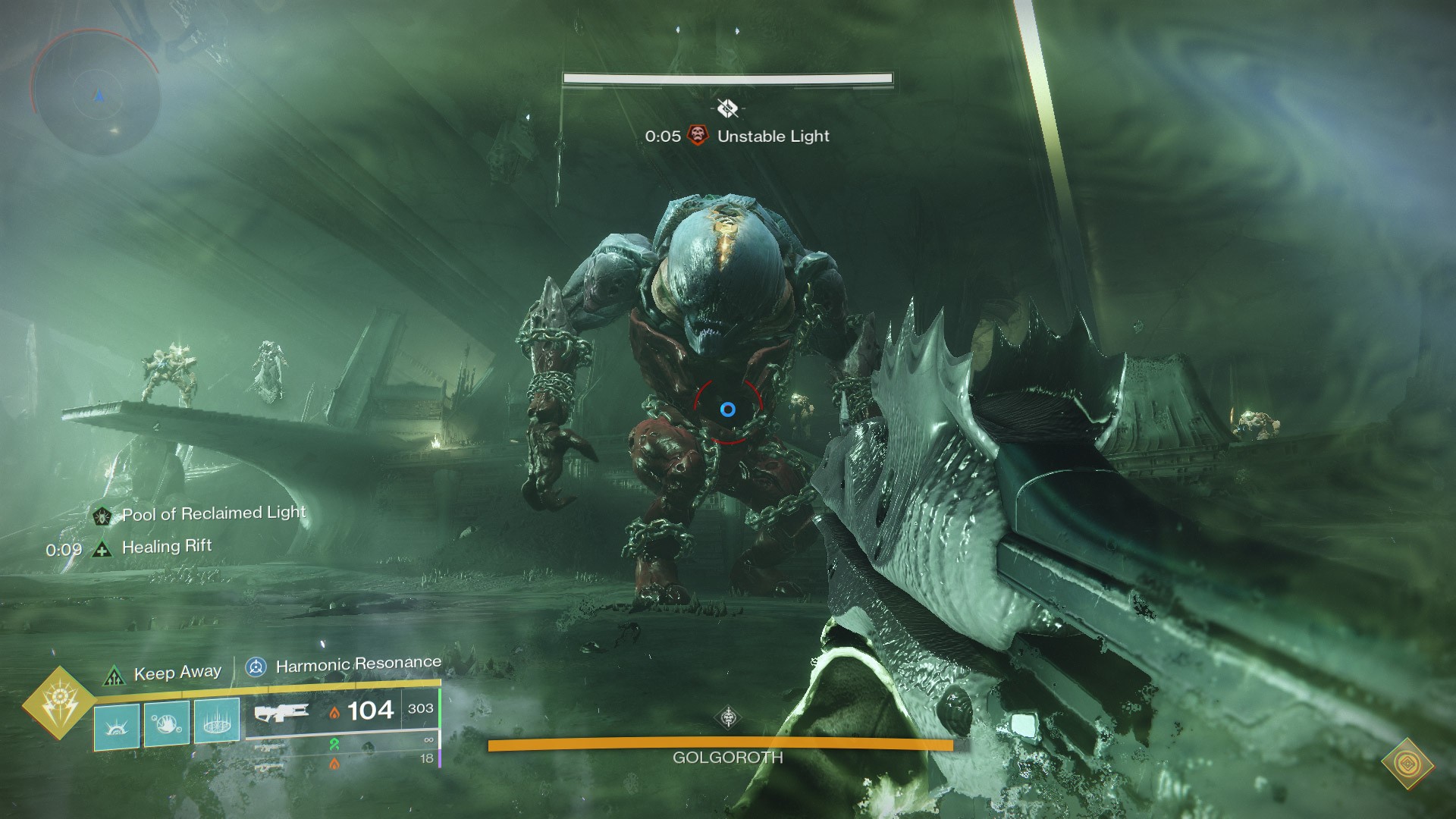
In Bungie’s testing following the preview, the placement of the de-buff channel (on the right-side) was met with friction, leading them to make changes and share the updates with the community.
However, the final version they shipped still left a large portion of the player base dissatisfied.
Shipped HUD following showcase
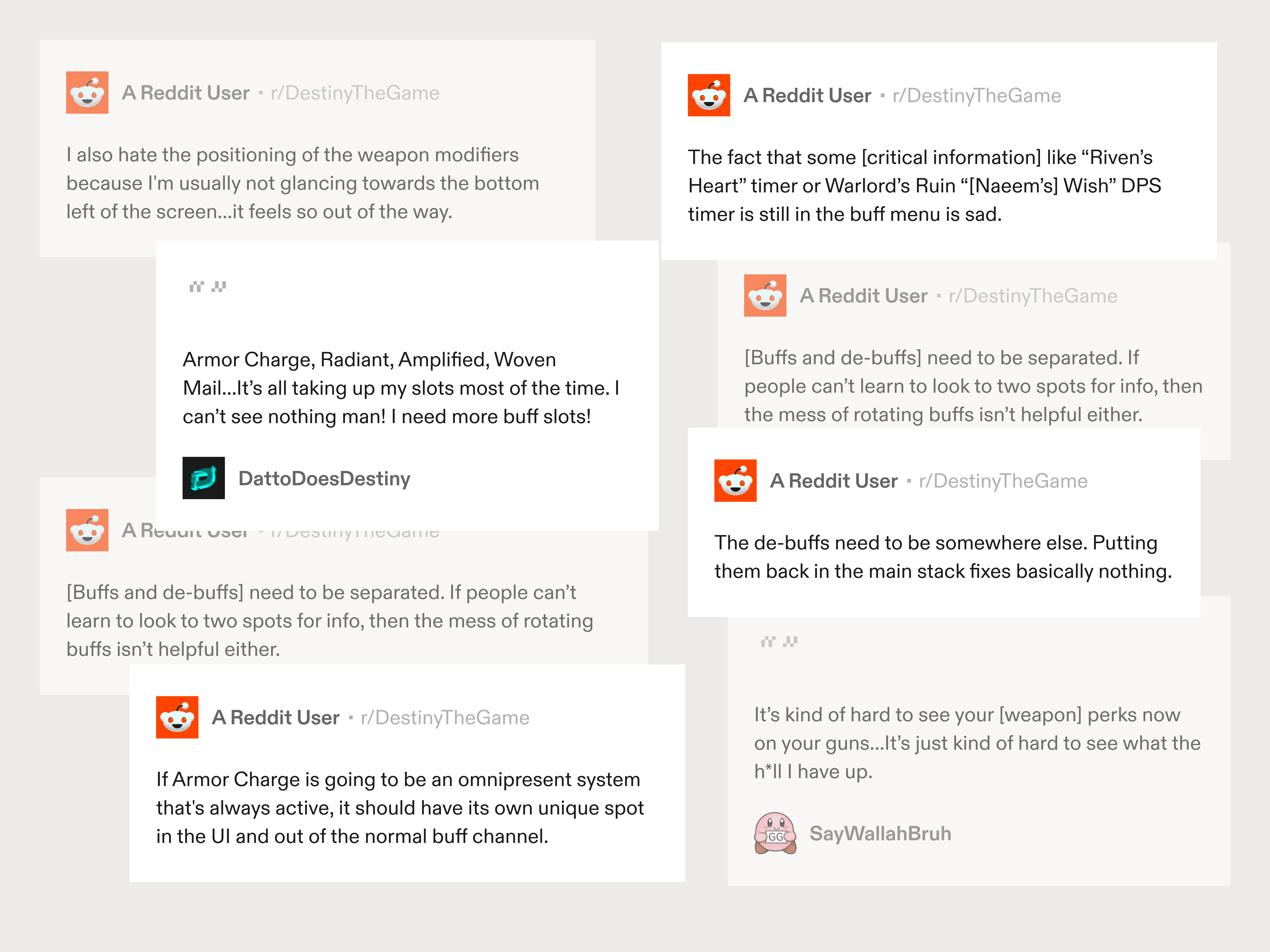
Community response
[THE PROBLEM]
The newest HUD still had limits that made key information unavailable and difficult for players to quickly access
Buffs + De-buffs = Information overload
A notable issue players had about the updated HUD was the combination of the buff and de-buff modifier channel on the left of the screen, which was still limited to 4 slots.
Even with Bungie’s promise of “prioritization” and the additions of 2 other channels, the sheer influx of information provided to players still made it too much to handle.
(Watch from 13:33 – 14:32) Community representative speaks on info. overload
Channel limits = Overcrowding
Another emerging issue was the limitations on the 2 new channels, particularly the critical information channel, which was capped at just 2 slots—done so that players can “focus [only on] the most important modifiers [there.]”
As a result, modifiers that players considered critical information would occasionally bleed into channels it didn’t belong.
Only 2 critical information modifiers shown at a maximum
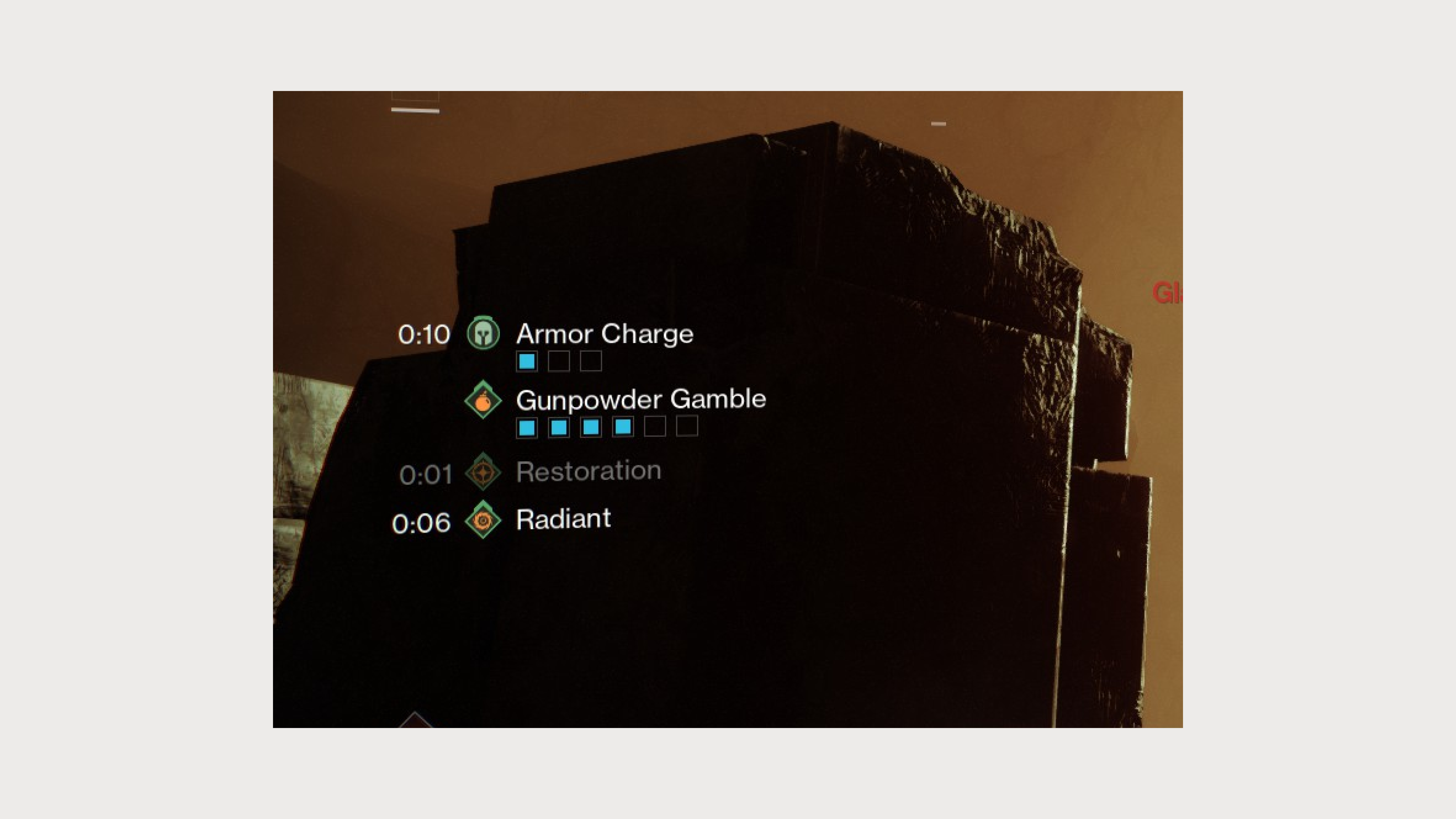
Armor Charge: More than just a “buff”
The last issue players had were centered around the “Armor Charge” modifier. This buff has been a core gameplay mechanic since its introduction, and in many cases, it never leaves the buffs channel depending on what build players have.
Due to its prominence in the current sandbox, players have voiced their desire for a dedicated channel to manage Armor Charges more effectively.
Armor Charge takes up significant real-estate on the left of the screen
[THE CHALLENGE]
Partition screen real-estate further without overwhelming players with too much information.
[RESEARCH]
Understanding player focus in the HUD
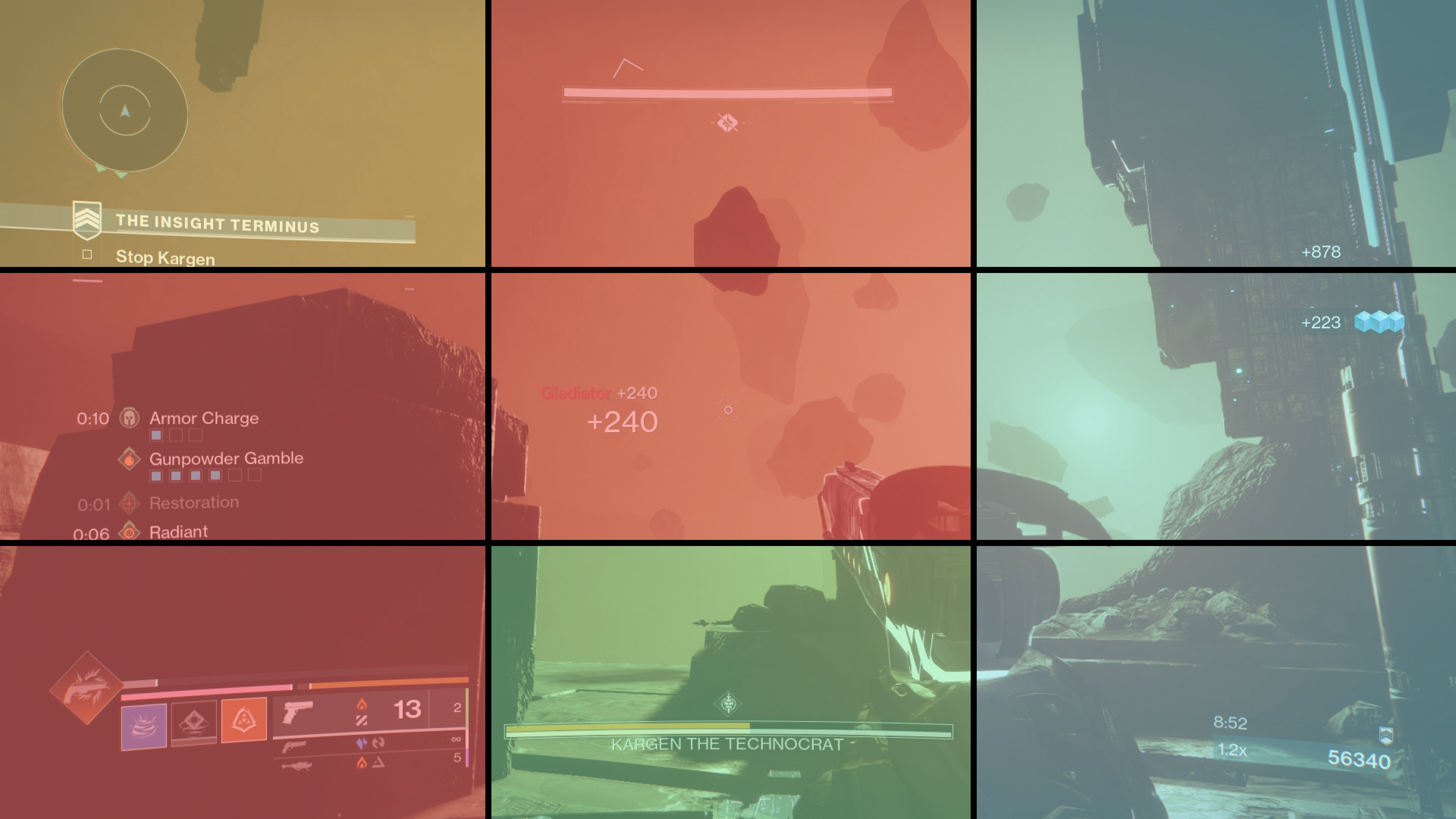
Given the challenge at hand, it became important to assess where players naturally focus their attention for game information. Player habits can vary from game to game, so a focused analysis of Destiny’s past HUD iterations was necessary.
The aim was to pinpoint areas of the screen where players felt most comfortable receiving visual feedback during gameplay.
Destiny HUD iterations
By examining all versions of Destiny's HUD from the past decade, a clear pattern emerged. This analysis produced a heatmap (an approximate one), illustrating where players have been conditioned to focus their attention over time.
Warm tones = High attention area ⎮ Cool tones = Low attention area
The results indicated that gameplay information had traditionally been concentrated in the middle and left portions of the screen.
This aligned with Bungie’s own focus group findings, where players expressed discomfort when forced to look to the right for game info.—having grown accustomed to the belief that nothing of importance would be placed there during gameplay.
[IDEATION]
Finding the balance
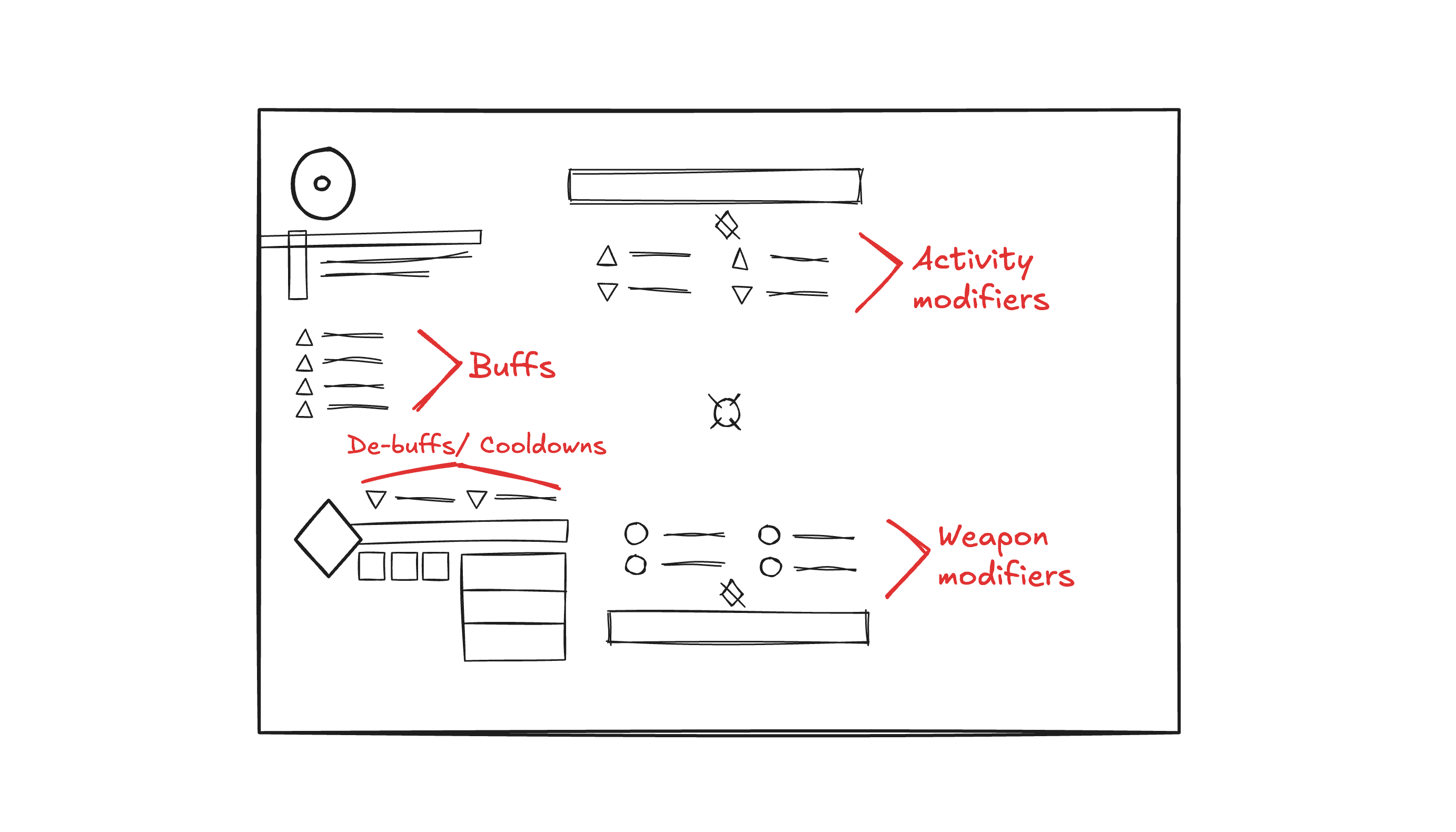
Keeping the above problems and research in mind, the next step was to explore various new approaches for a new HUD.
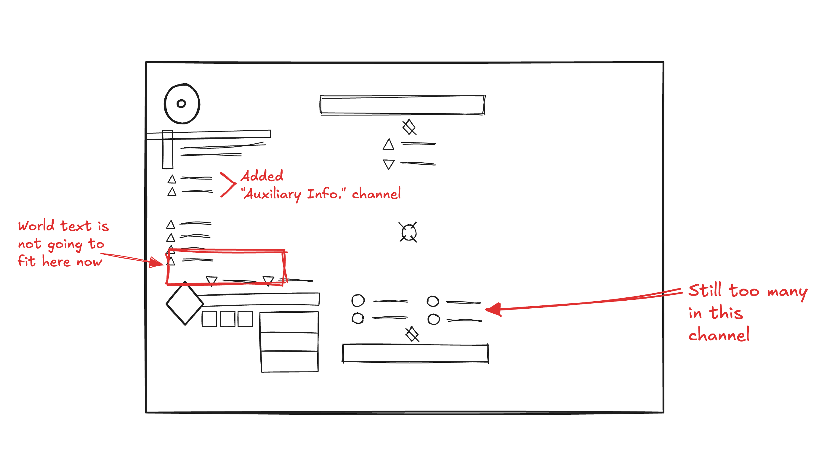
1st approach
The initial design allowed for more modifiers to be displayed on screen, but overlooked the minor screen elements (world text, subtitles, notifications, etc.) they’d be taking the space of.
First draft for new HUD
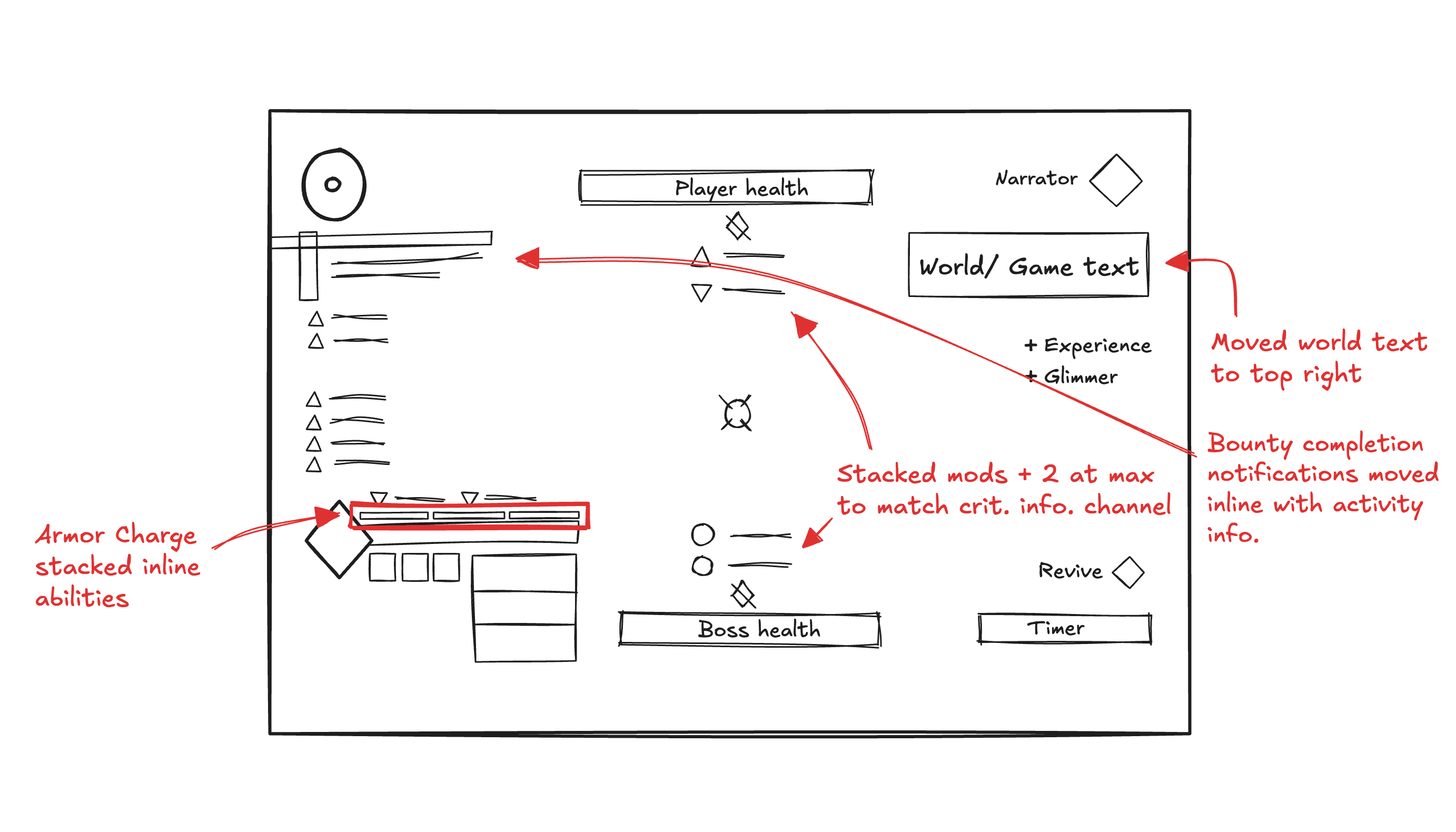
2nd approach
The design that followed did better to compensate for minor screen elements, but still missed the mark with fitting the “World Text” chat on the left side.
Also, design consistency with the top and bottom middle modifiers was broken, and there was still no remedy for the Armor Charge problem.
Second draft for new HUD
3rd approach (final)
The final design addressed all the previous issues—modifier channels, both new and existing, were seamlessly integrated into the screen without intrusion. Minor elements that had been displaced were repositioned using best practices from other first-person shooter games.
Additionally, a dedicated Armor Charge channel was introduced in a logical, unobtrusive way.
Final draft for new HUD
[DESIGNS]
Another new HUD
The new design builds on the existing framework established by Bungie—polishing and further realizing their original design goals plus more.
Worst-case for new HUD (PvE)
Worst-case for new HUD (PvP)
"Wait…what changed?"
More modifier channels…
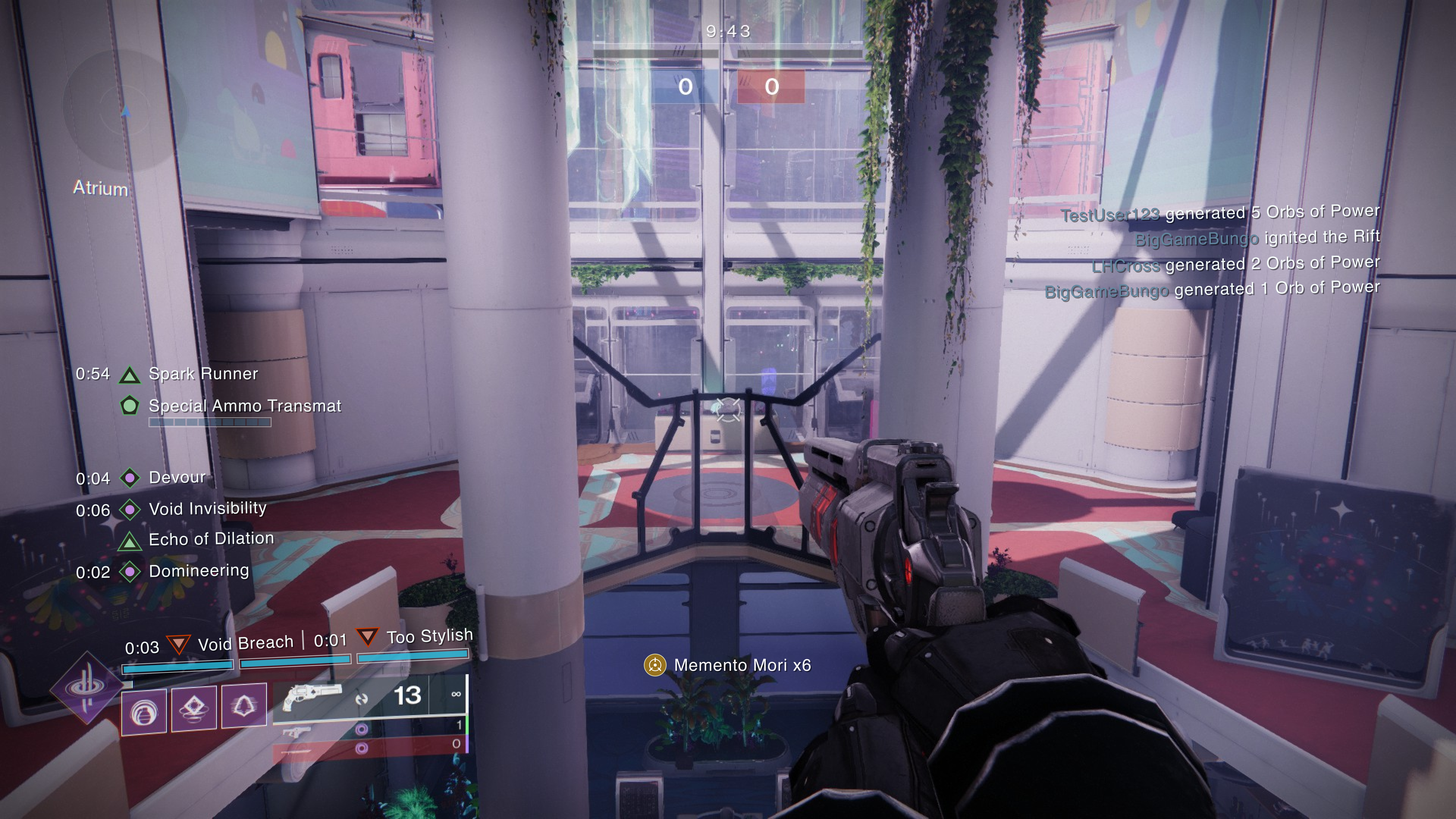
Auxiliary Information channel
The modifiers that appear in this channel (under the radar/ objective) display activity-specific information that is important, but not enough to constitute its belonging in the existing critical modifiers channel (which is limited to 2 modifiers at a time).
This channel is also limited to 2 modifiers max, making a total of 4 dedicated activity modifier slots (2 critical info + 2 auxiliary info).
Research across multiple game modes has shown there is no activity with more than 4 activity/ encounter specific modifiers being displayed at once.
Auxiliary information placed between buffs and the radar
De-buff channel
Simple and straightforward, this channel (under the buff channel) separates buffs and de-buffs to reduce cognitive load for players.
Channel is limited to 2 de-buffs max—prioritizing de-buffs with longer uptimes as those typically have more impact on gameplay.
De-buffs placed between buffs and the Armor Charge meter
…Plus more
Armor Charge meter
Placed above the Super meter, the Armor Charge meter informs players how many charges they have left while maintaining a design that is consistent with the rest of the HUD.
Armor Charge meter placed under the de-buffs channel
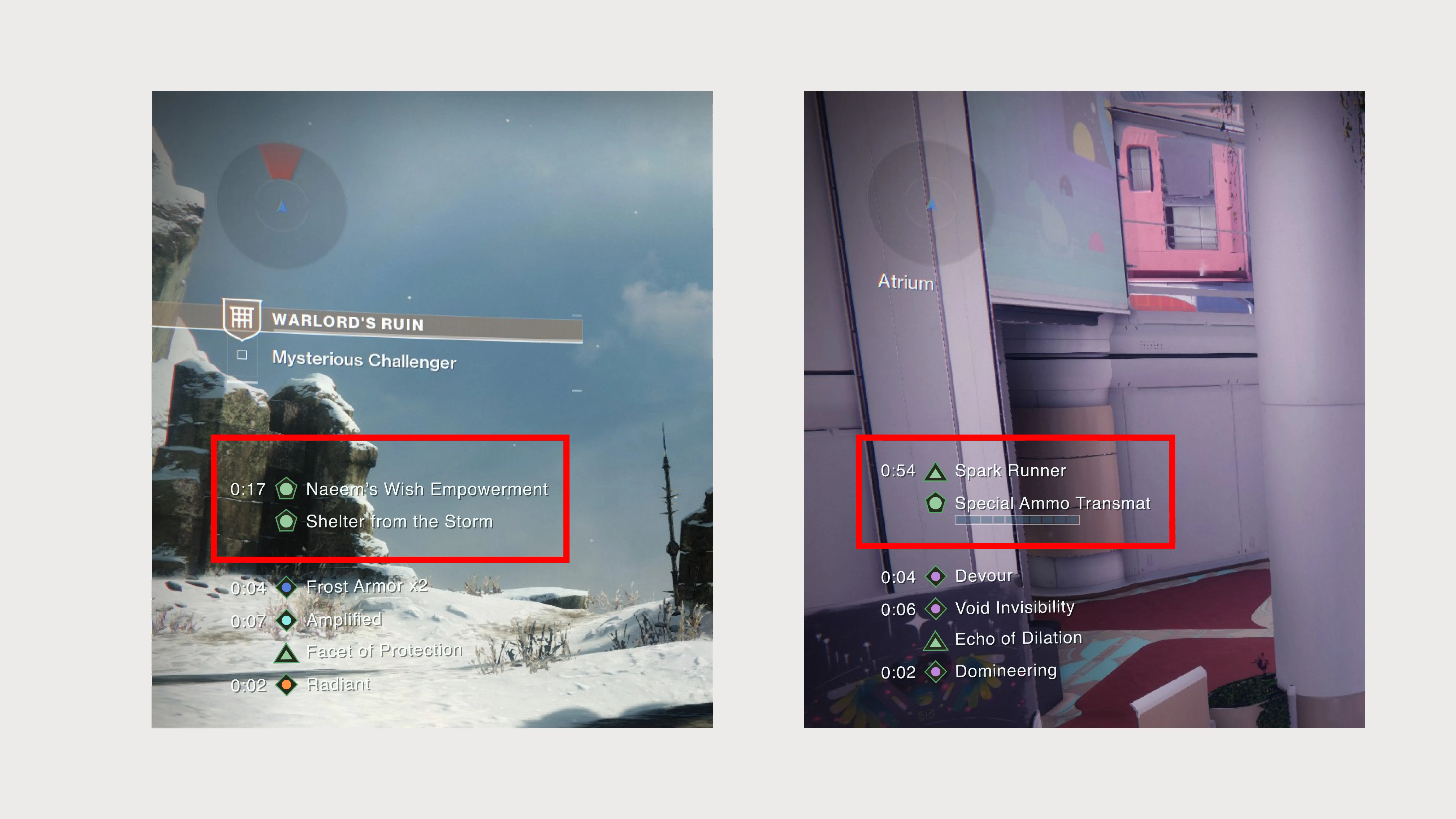
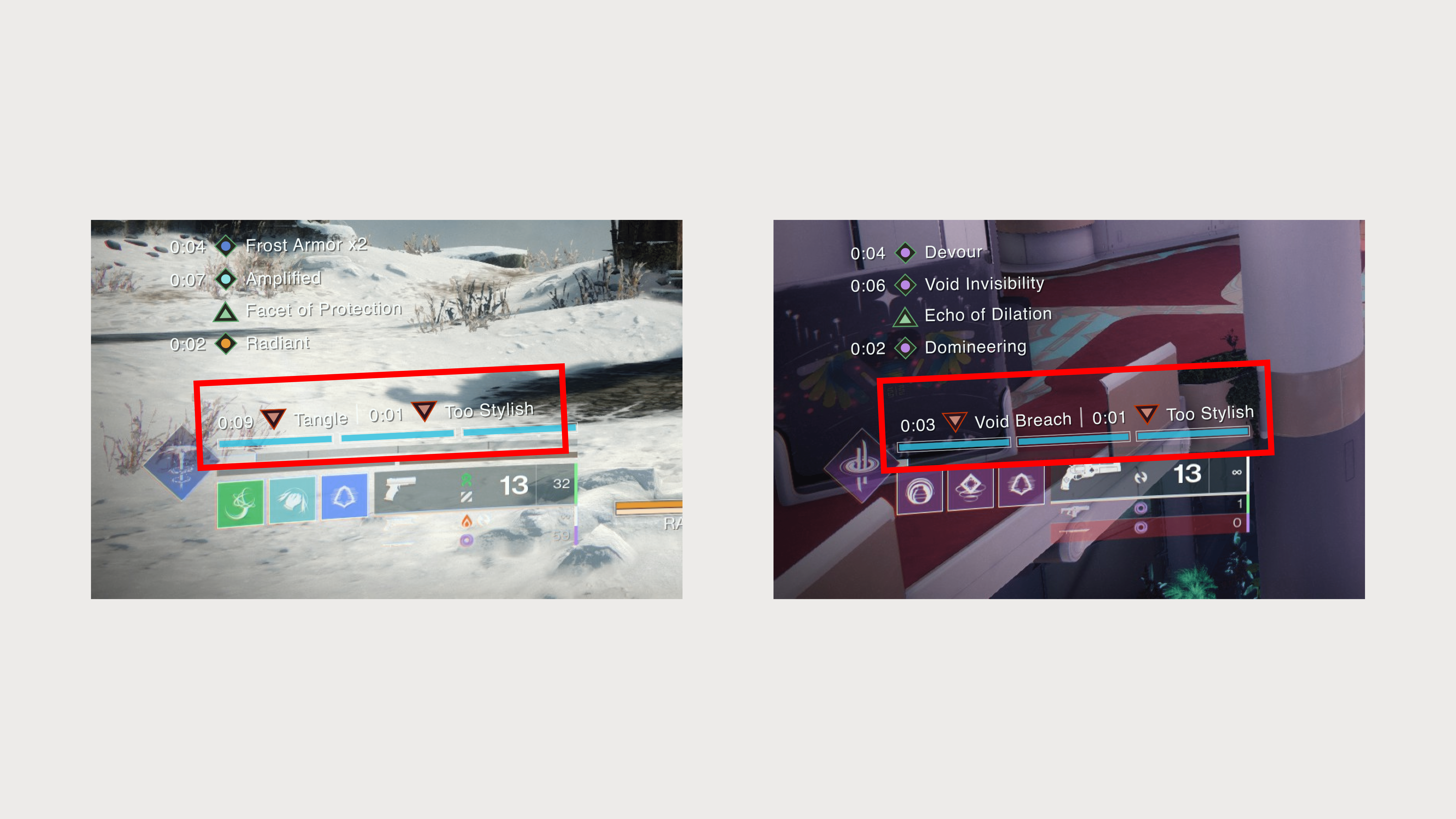
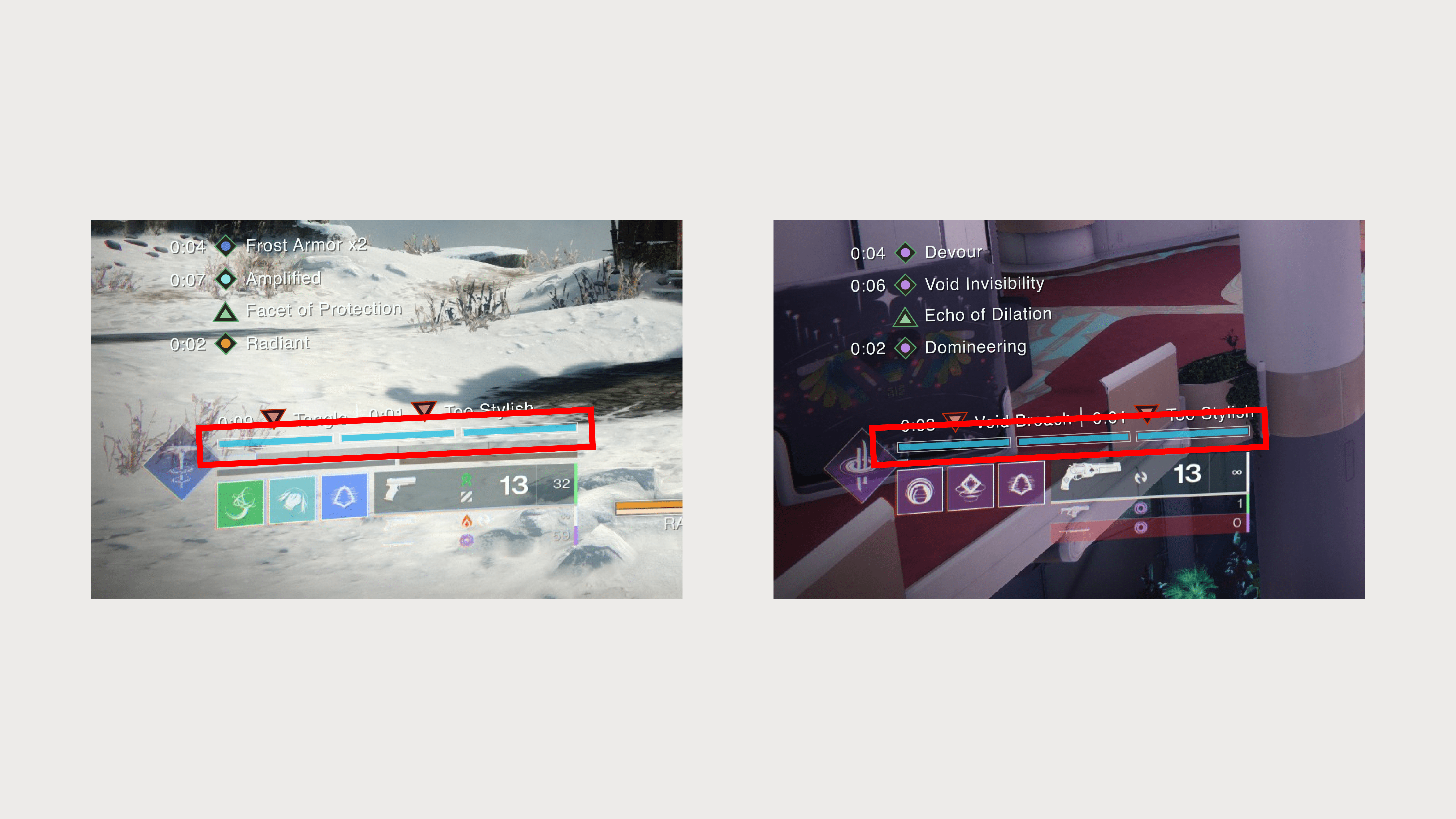
Condensed modifier copy
This was a problem that came about when designing for the new HUD.
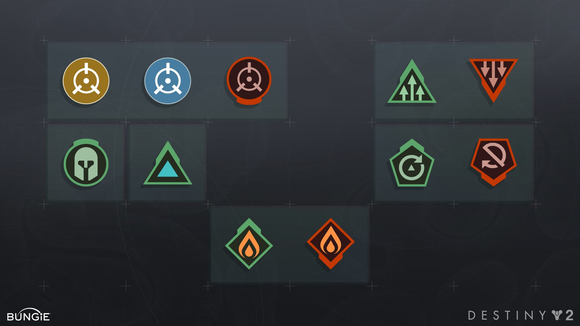
Many of the modifier titles were unnecessarily long. When revisiting my research, I discovered that the modifier iconography had also been updated alongside the HUD.
With these new icons, there was no longer a need to explicitly state the type of de-buff a player has, as the new icon's color, shape, and name now provide sufficient context.
Destiny's iconography update to improve readability
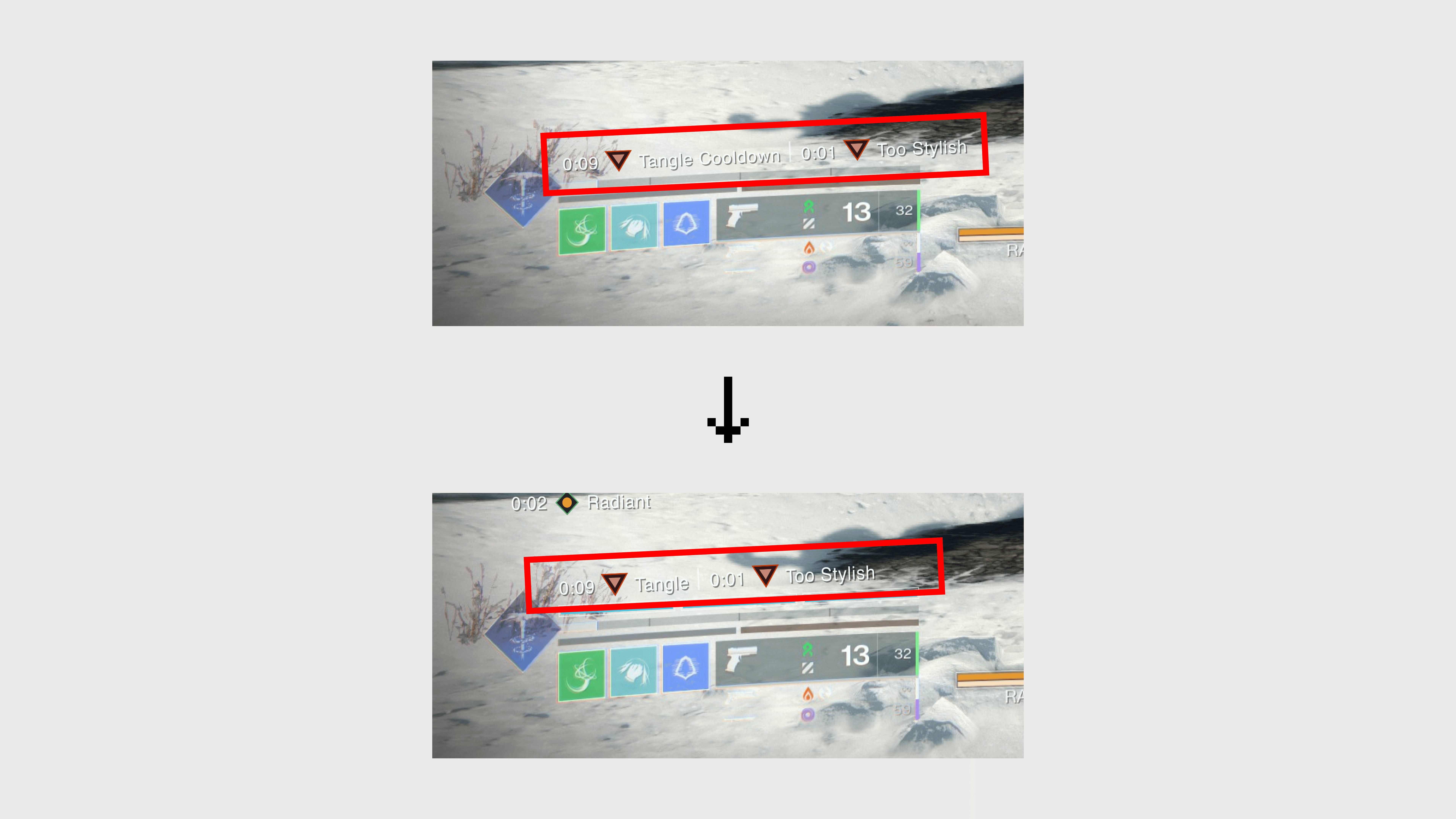
The resulting change is a more concise and scannable description of what is going on during gameplay.
Removed redundant keywords such as "cooldown" in modifier copy
[THE RESULT]
Community feedback
I reached out to the community through Destiny 2’s forum page on Reddit. The new HUD design was well received—garnering a 77% upvote rate across 12K users.
[RETROSPECTIVE]
Good things take time
Given the time and resources I had, I believe I developed a solid and practical solution to the issues raised by players. However, with the opportunity to collaborate with a development team and conduct proper testing with focus groups, I’m confident the results could have been even more refined.
Design is an iterative process, and testing these concepts in a structured environment would have provided valuable insights and feedback. This would have allowed me to further strengthen the design direction and improve the overall success of the solution beyond the positive response it received from the Reddit community.
