CleanGPT
Establishing native organizational features for ChatGPT
OpenAI has led the charge in the last few years with one of their flagship products in ChatGPT. While the main functionality has been well received and steadily improved, one recurring pain point that gets brought up is the lack of an organizational system within the product.
Let’s make sense of the uncertainty; let’s get organized.
[ROLE]
Product design
[TEAM]
Independent study
[TIMELINE]
1 month
[SKILLS]
Interaction design
Info. architecture
User research
Design systems
[CONTEXT]
People look to ChatGPT as more than a language model
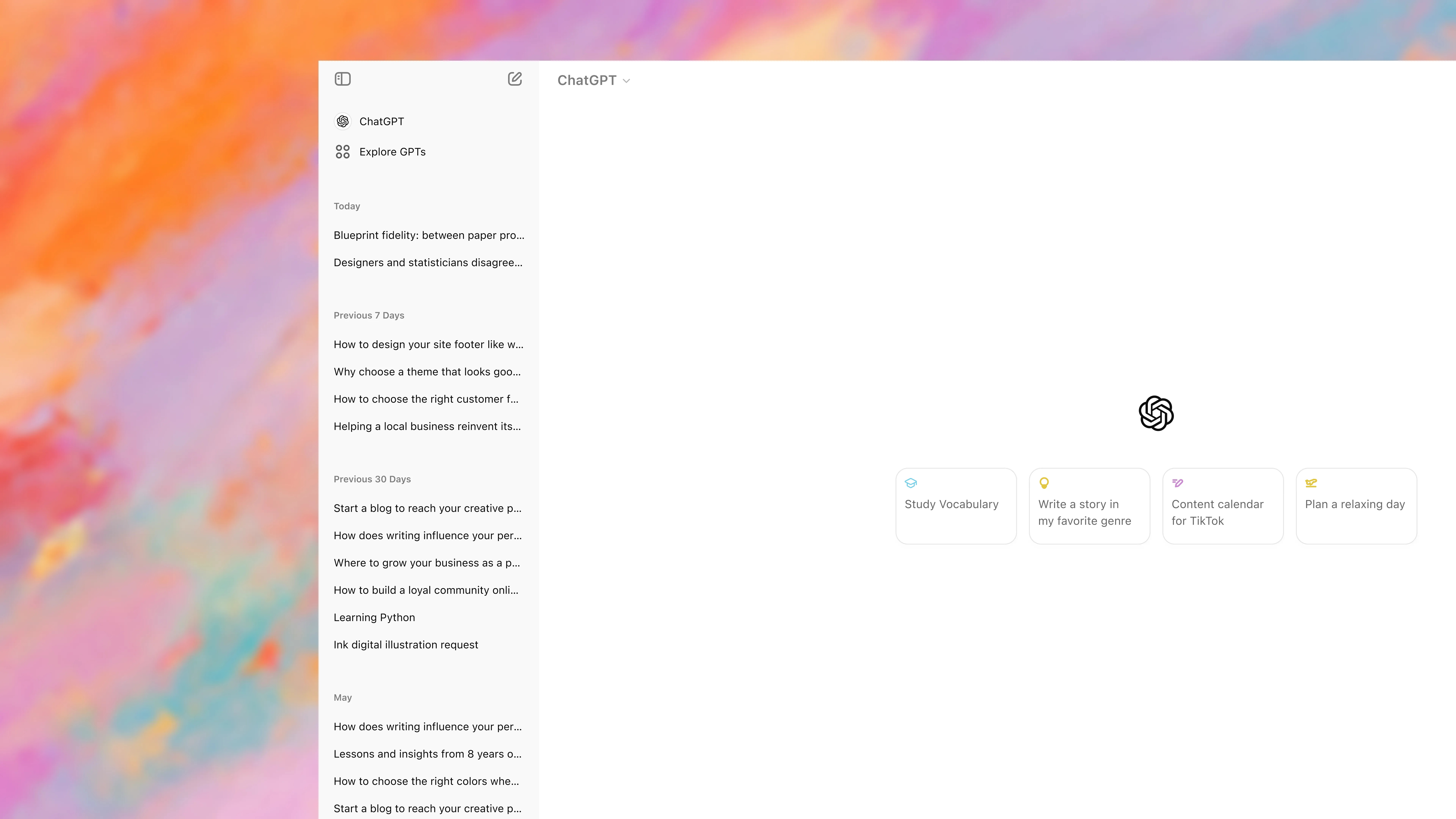
From simple queries to in-depth conversations, ChatGPT has evolved into a product more people rely on daily. However, these exchanges often get lost in a sea of unorganized chats, making it hard to extract lasting value.
Current ChatGPT UI
It's common for users to repeat queries with ChatGPT, as searching for previous answers often takes more time than simply asking again.
“ChatGPT is a perfect example of when the core function is [so] good that bad UX doesn't even matter.....until it does.”
Commenter from r/OpenAI
[PROBLEM SPACE]
Standing on the shoulders of 3rd-party extensions.
Despite the growth of the platform, a neglect of organizational tools has made it harder for users to interact with the product.
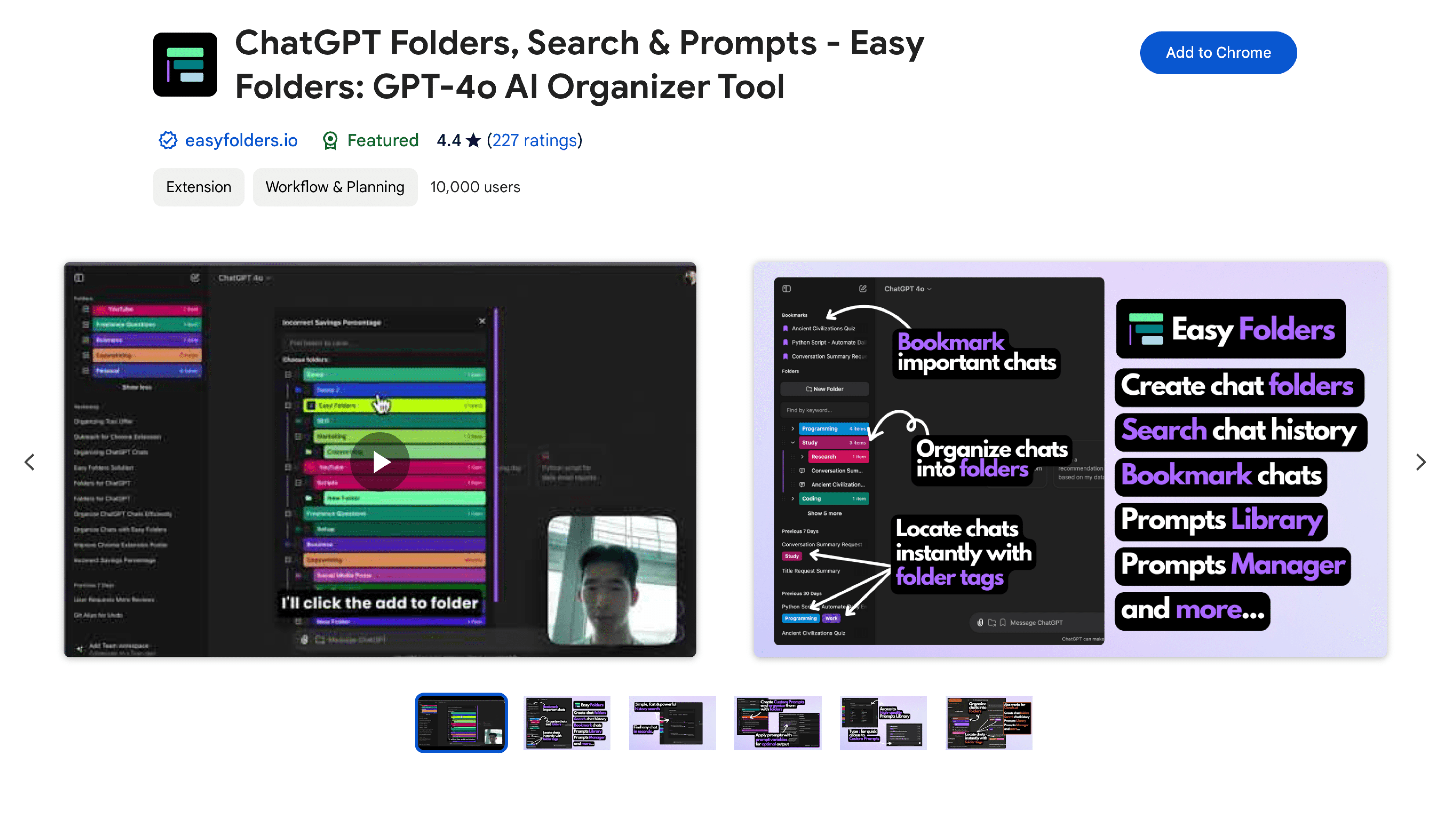
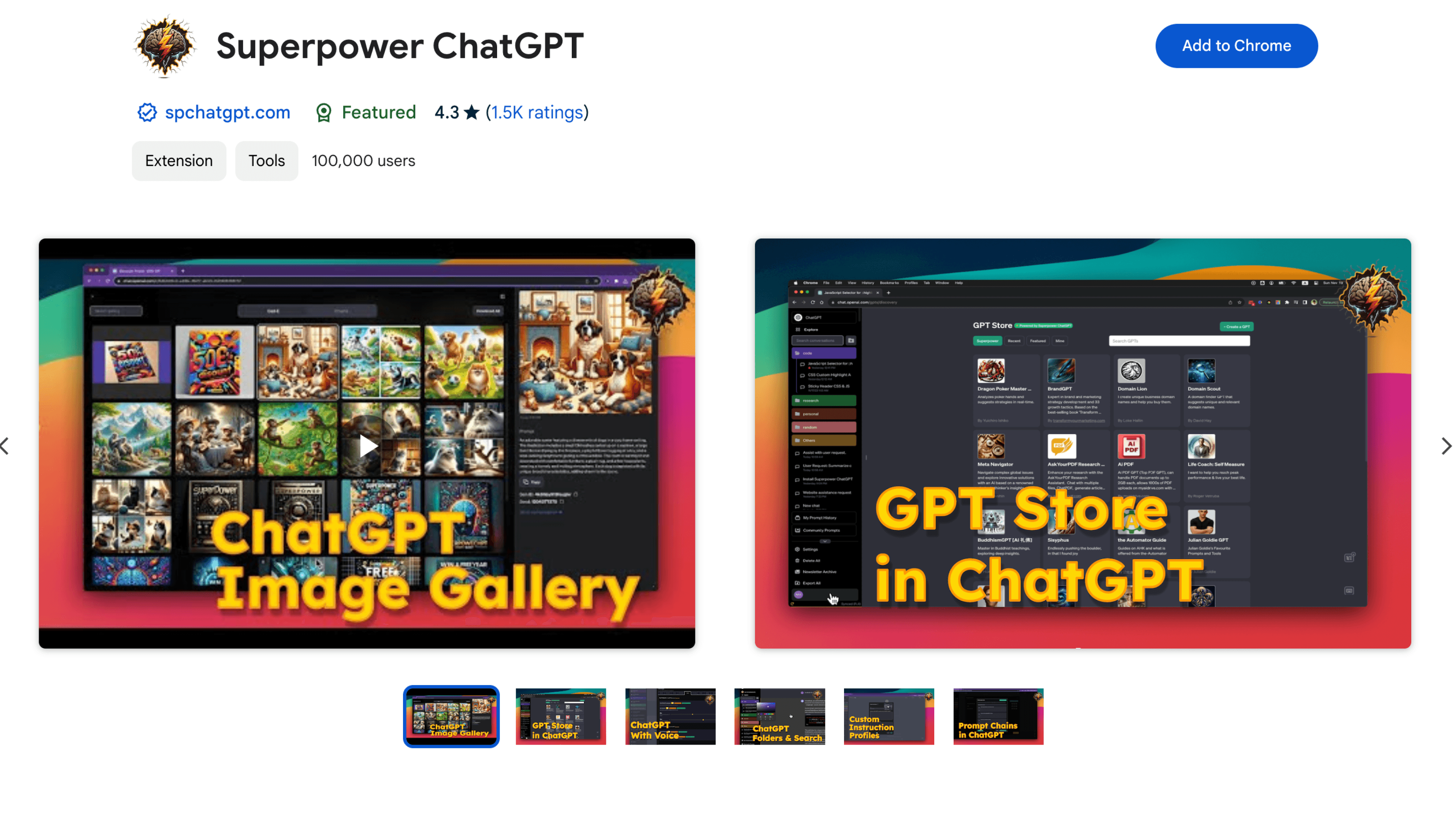
Passionate and knowledgable users have taken it upon themselves to create extensions that aid those who need it.
ChatGPT Folders plugin by @easyfolders.io
Superpower ChatGPT plugin by @spchatgpt.com
These solutions, however, are all only band-aid fixes to a larger problem—they have been fine for the time being, but patience has turned into annoyance amongst users.
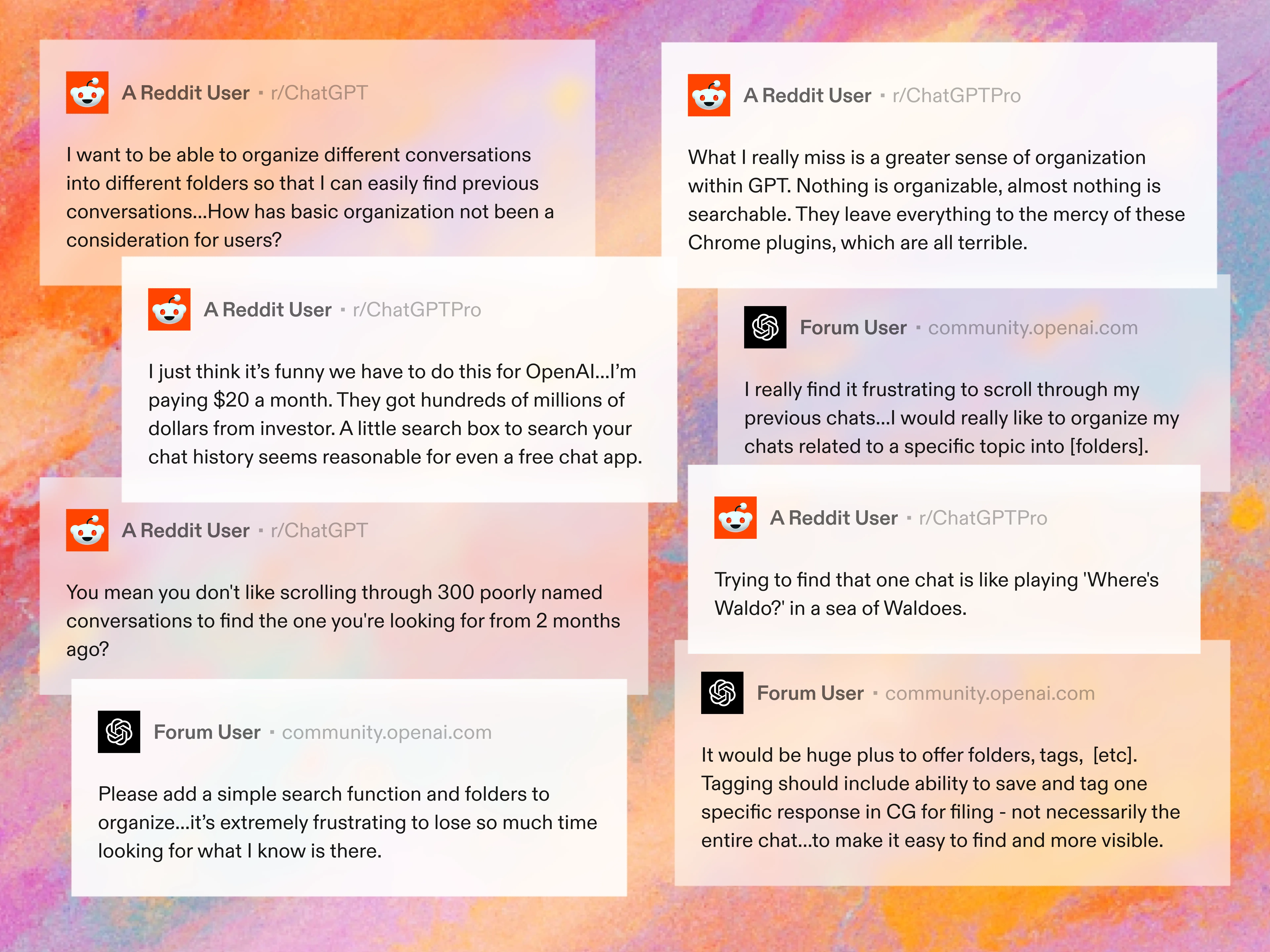
Community requests
Emerging opportunities:
[*]
Organizational AI
What if we leaned on AI for some organizational tools—aligning with OpenAI's brand identity?
[*]
AI Contextualization
Leveraging ChatGPT's context-based responses, what if we made it so it works in conjunction with these new tools?
[THE TASK]
How can we help reduce the time it takes for users to find target information from their conversations?
Introducing…
CleanGPT
[A NEW LOOK]
Tools for every need, accessible to everyone
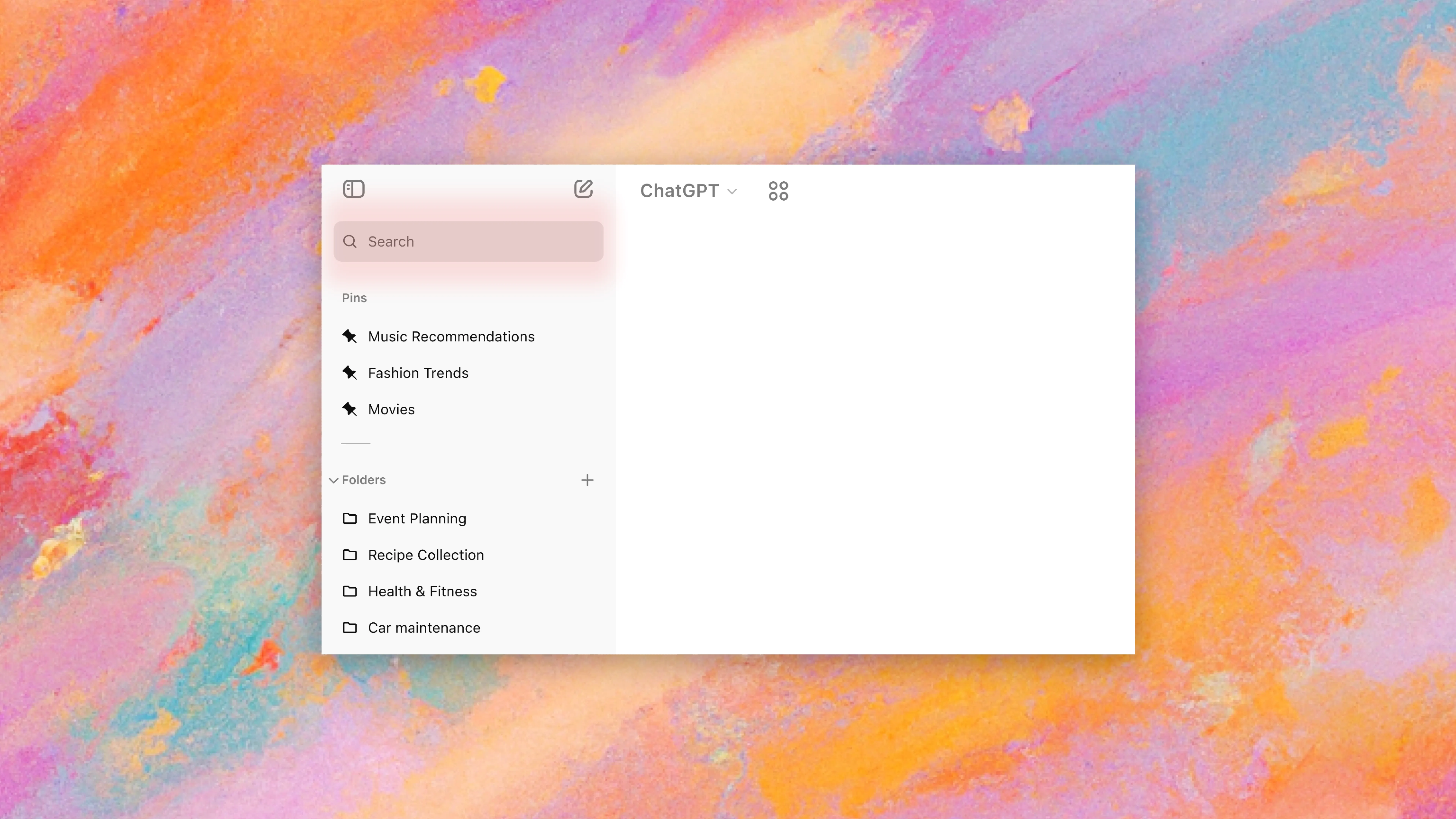
Search
Previously only available on the mobile app, keyword search for the web client is a feature that makes finding your old chats easier.
Search located at the top of the sidebar
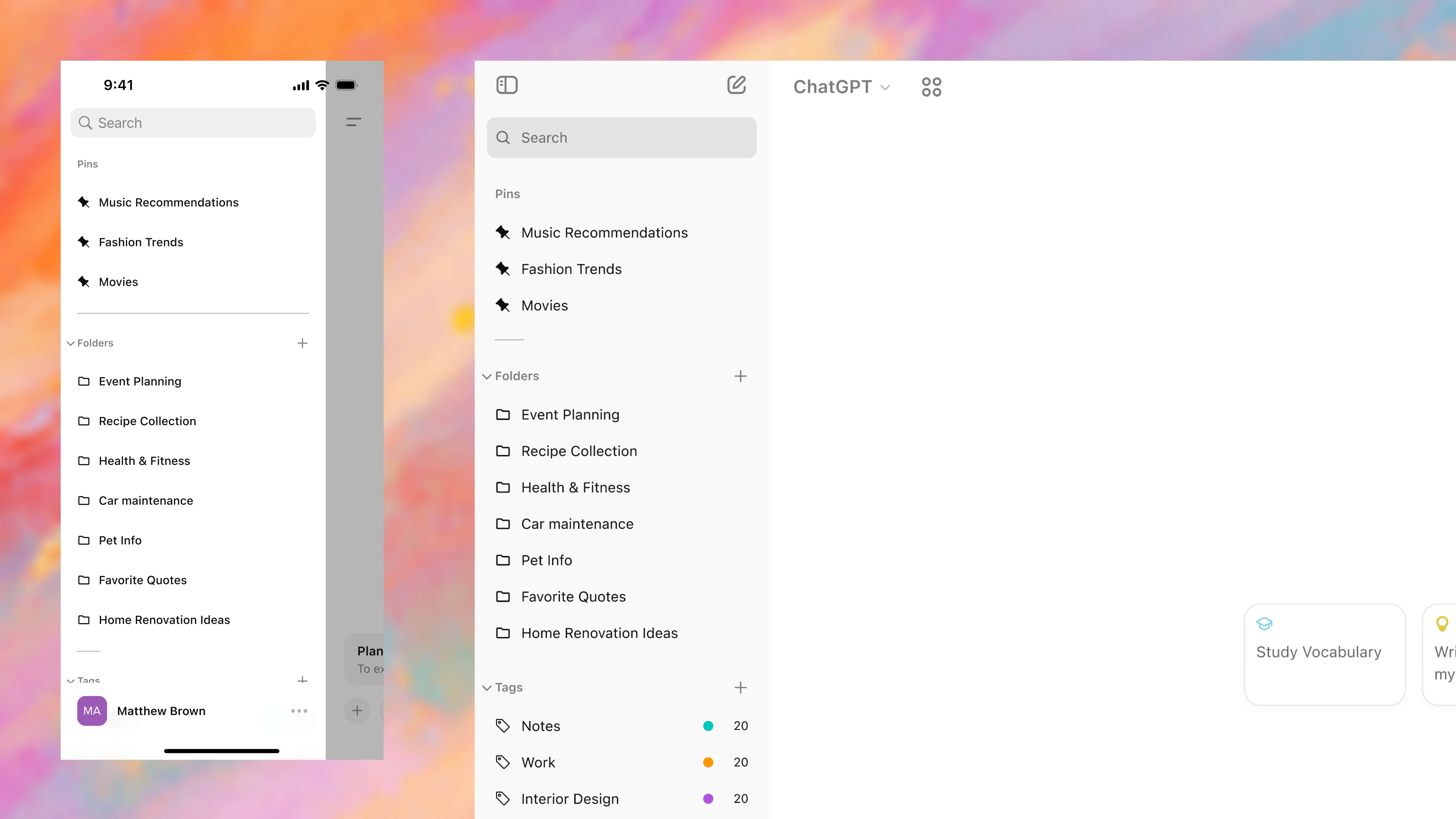
Folders
The old faithful. Select any variety of chats that you want organized into one folder for quick recall later.
Create folder from existing chats
Create an empty folder
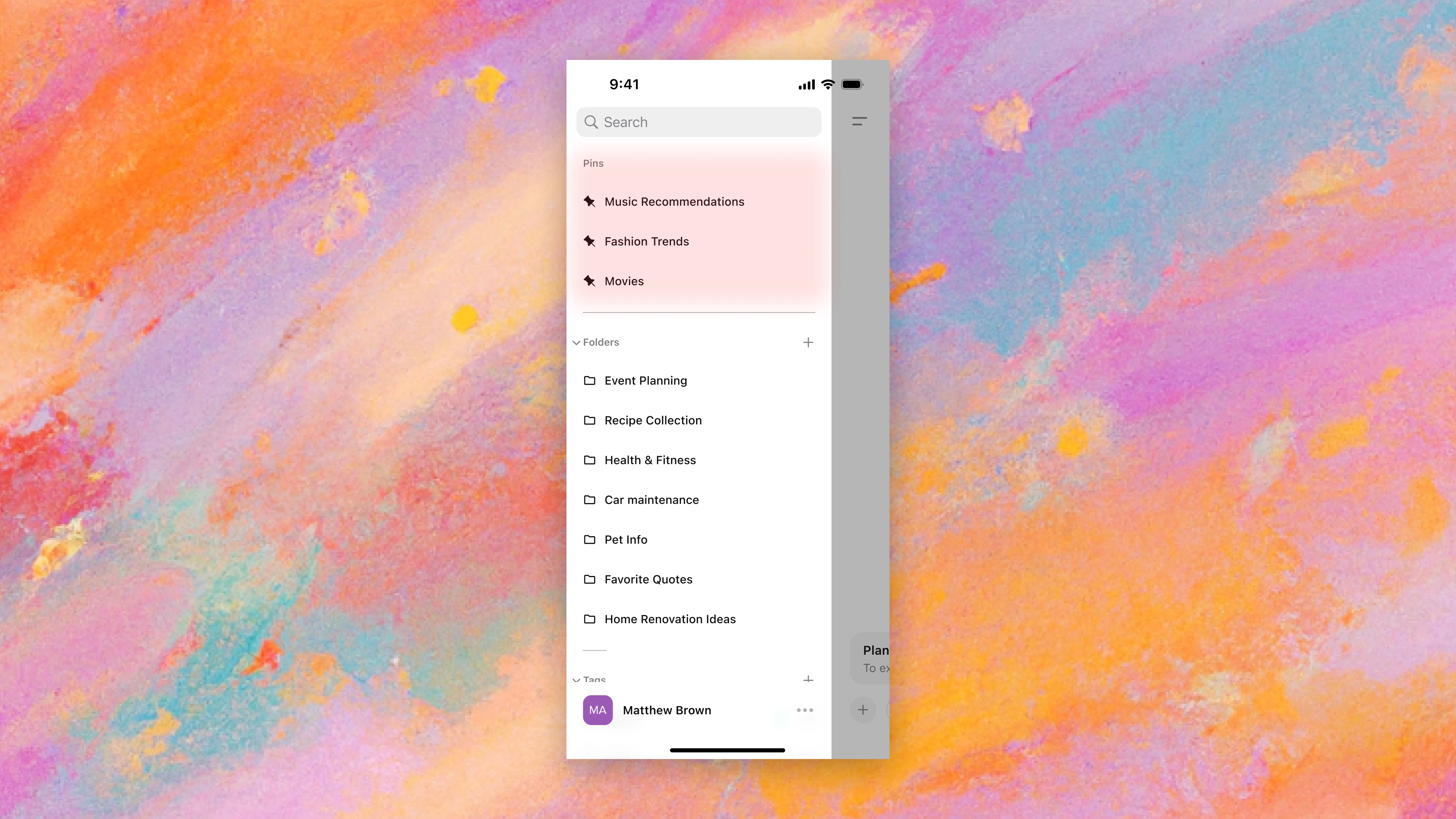
Pins
For the more important chats or folders. Always at the top of your sidebar for easy access.
Create pins from existing content
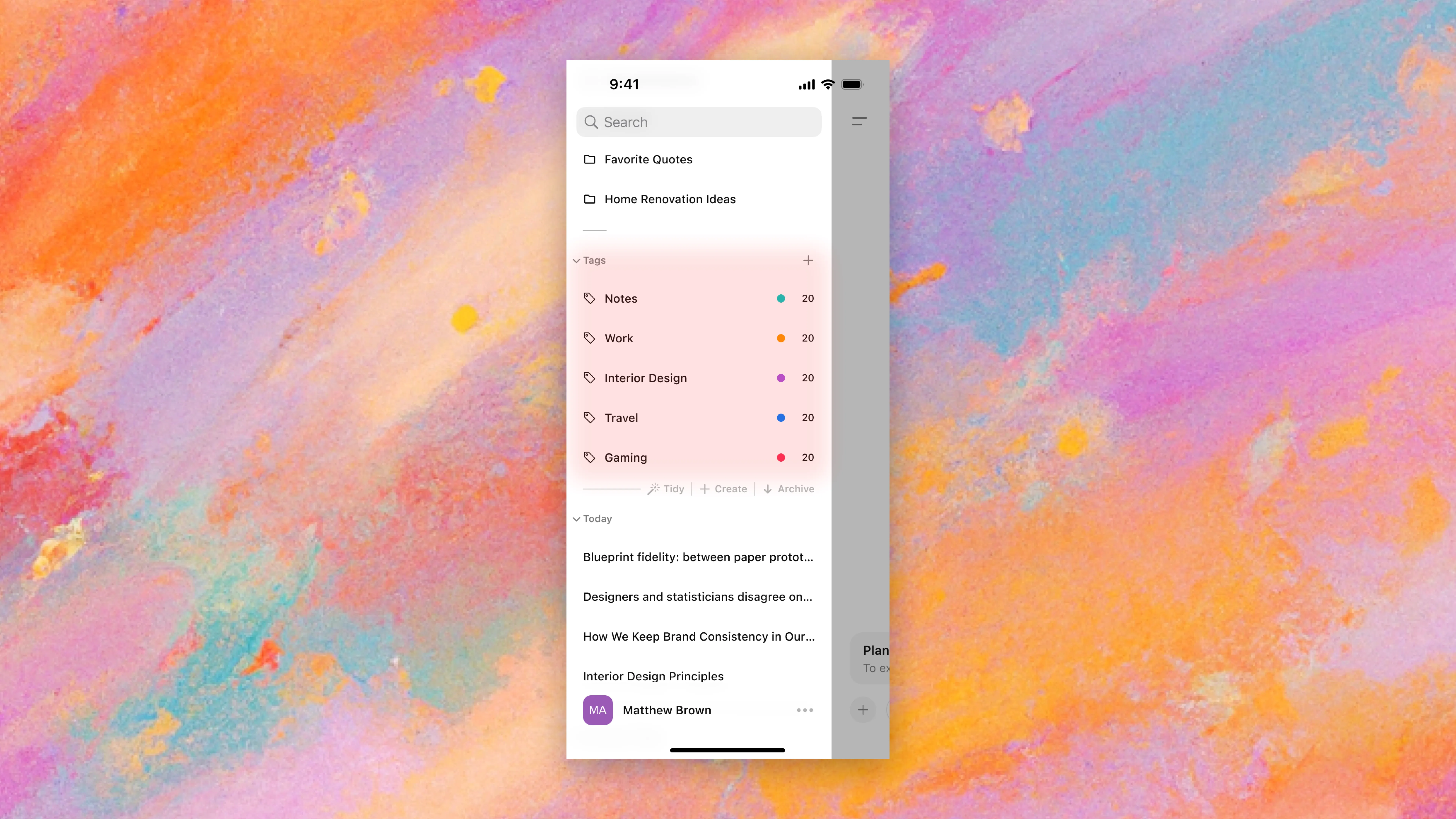
Tags
For the users that tend to switch topics often within one chat. Refer back to specific queries rather than entire chats when needed.
Create tags from queries
Refer back to queries through tags
Tidy
Too many chats to sort manually? Click the “Tidy” button in the sidebar and AI generate folders automatically.
Inspired by the Arc Browser.
Generate folders in one click using AI
What does this look like on mobile?
While the initial scope was intended to cover design issues within the desktop web client, research revealed that ~40% of ChatGPT's users access the platform via mobile. Of those, 60% use the mobile app rather than the mobile web client.
As a result, the scope was expanded to include how these features would be presented for the mobile app experience.
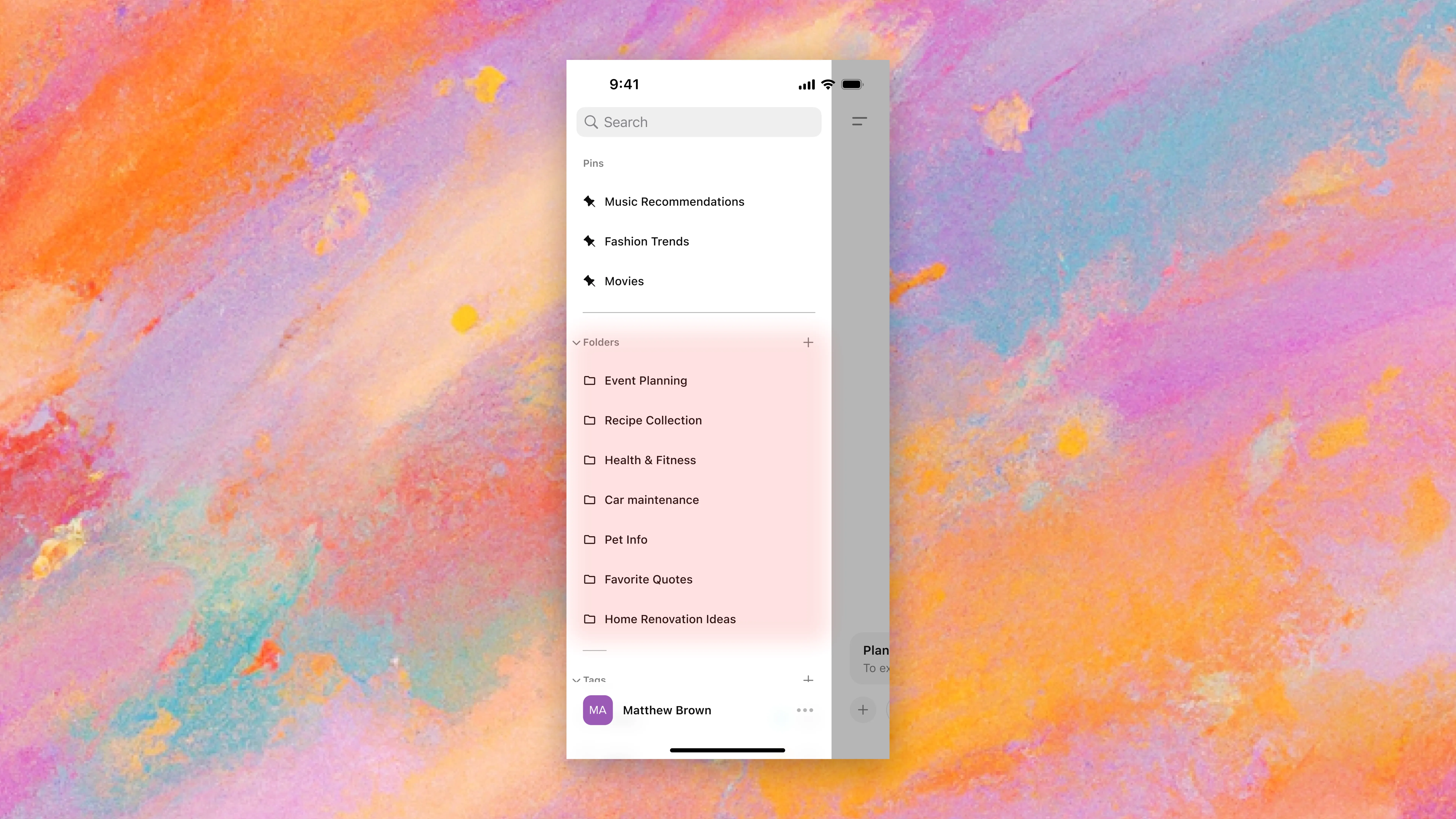
Folders (Mobile)
Pins (Mobile)
Tags (Mobile)
Tidy (Mobile)
[MORE CONSIDERATIONS]
How do we make it work?
To accommodate all the additions made, an adjustment to existing sidebar systems was needed.
Changing GPTs
Desktop
The “GPT picker” is now apart of the dropdown menu to the right of the sidebar.
This dropdown is now fixed to that area of the screen as well—a pseudo-sidebar element.
Change GPTs from the top-left dropdown
Mobile
The mobile GPT picker is now apart of the center logo.
It’s visual impact relative to other elements on the screen gives sufficient context for it to be registered as an interactive button.
Change GPTs from the center icon
Explore page
Desktop
The explore page was made into an icon next to the GPT picker.
It’s a one-click toggle that enables the explore page. When toggled off, it returns to the default GPT.
Accessing the explore page
Mobile
The mobile explore page is also apart of the center logo's interaction.
Like its desktop variant, it’s a one-click toggle that enables the explore page.
Entering the explore page from the center icon
Varying levels of organization makes room for personalization
Having every tool isn’t just a means of organization. It’s a way for users to break the monotony, and separate their “ideal” ChatGPT from someone else’s.
[RETROSPECTIVE]
What's next?
More research
This case study was an aggregate of qualitative responses from the community and personal anecdotes. I want to conduct further research on what other quality-of-life improvements can be made for ChatGPT.
Also, I'd like to test specific aspects of this concept to further reinforce the values presented here—namely the re-imagined "GPT Picker" and "Explore GPT" flows to see if they still feel like natural interactions for users.
Expand upon these ideas
This was a sprint. By nature, some minor (but intentional) oversights were made in the designs.
Going back and creating custom icons, ensuring design system consistency (outside of just color), and other minor tweaks would really bring these ideas to life.
