Kahwa rewards
Optimizing reward systems to drive long-term business growth and conversions
Kahwa Coffee’s reward system was changed in Q1 of 2024. They shifted from a QR code scanning model to a scan-free approach—likely aimed at boosting user engagement with the Kahwa app.
This was an independent study to draft solutions to emerging problems that were noticed in the rollout of the app’s new functionality. This work touched solely on the product’s reward systems and how they could be adjusted in consideration of user goals.
[ROLE]
Product design
[TEAM]
Independent study
[TIMELINE]
2 months
[SKILLS]
Interaction design
Visual design
User research
Design systems
[TL;DR]
The next iteration of Kahwa rewards: easy to understand and simple to use.
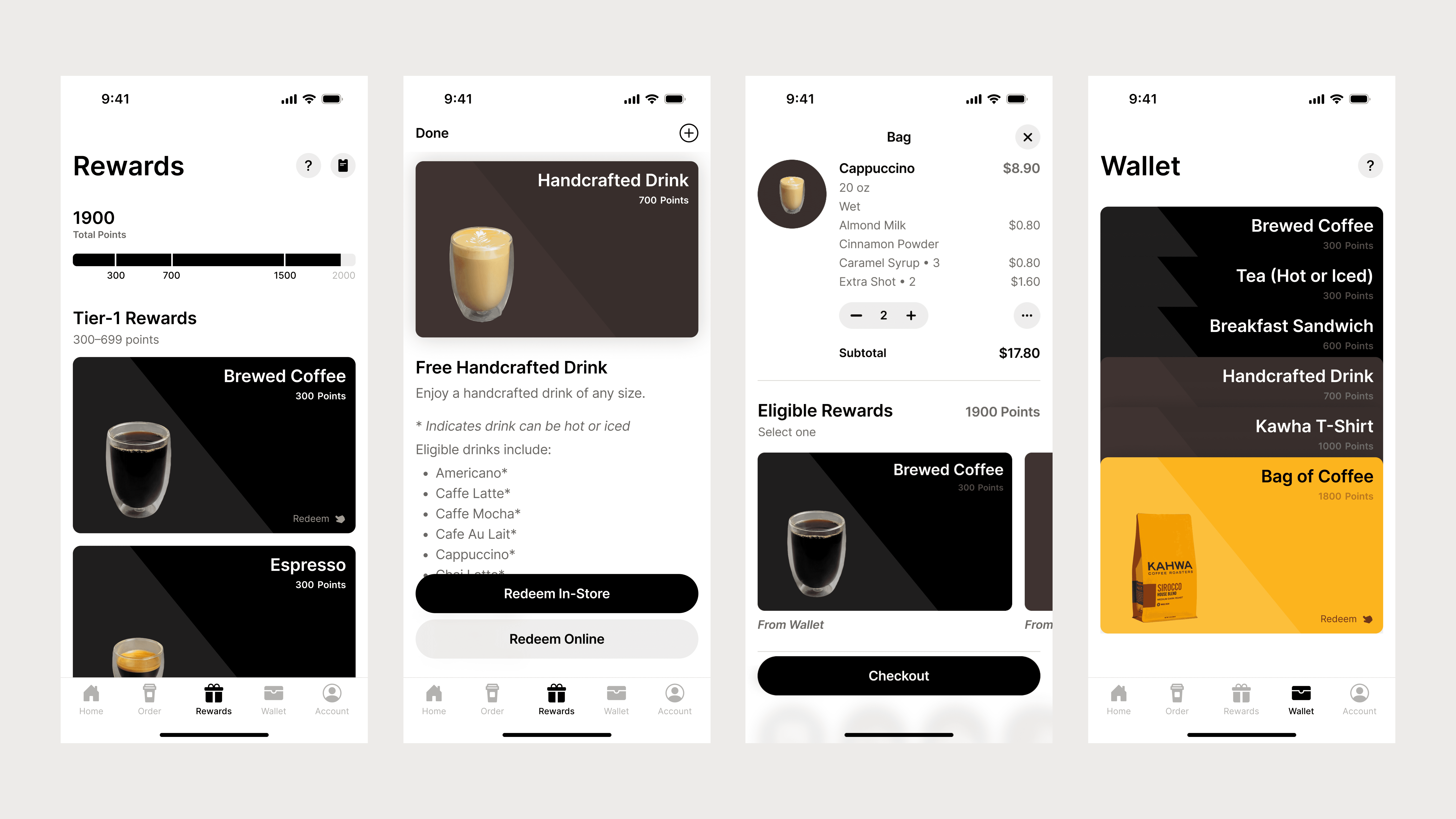
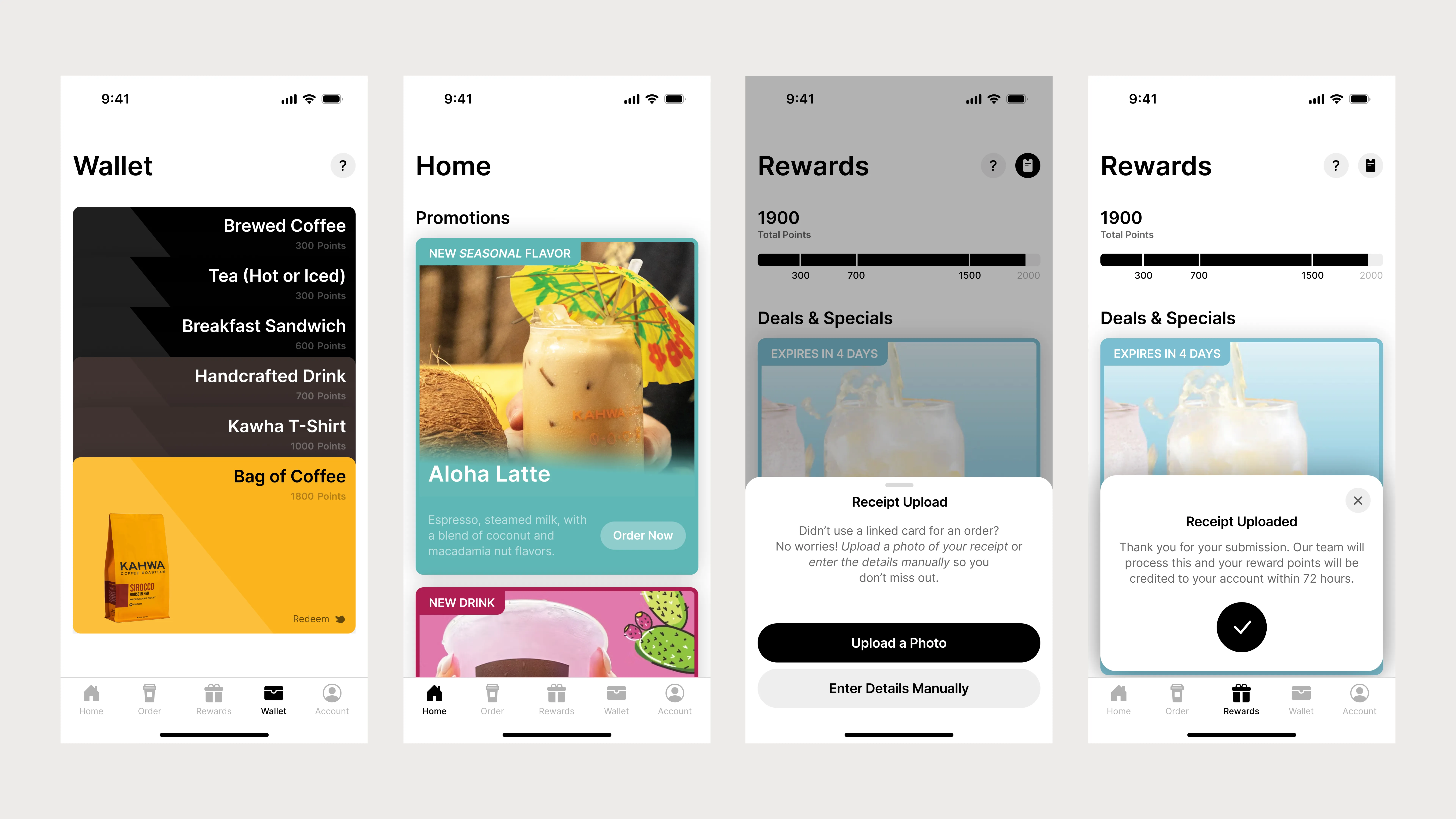
Sample rewards screens
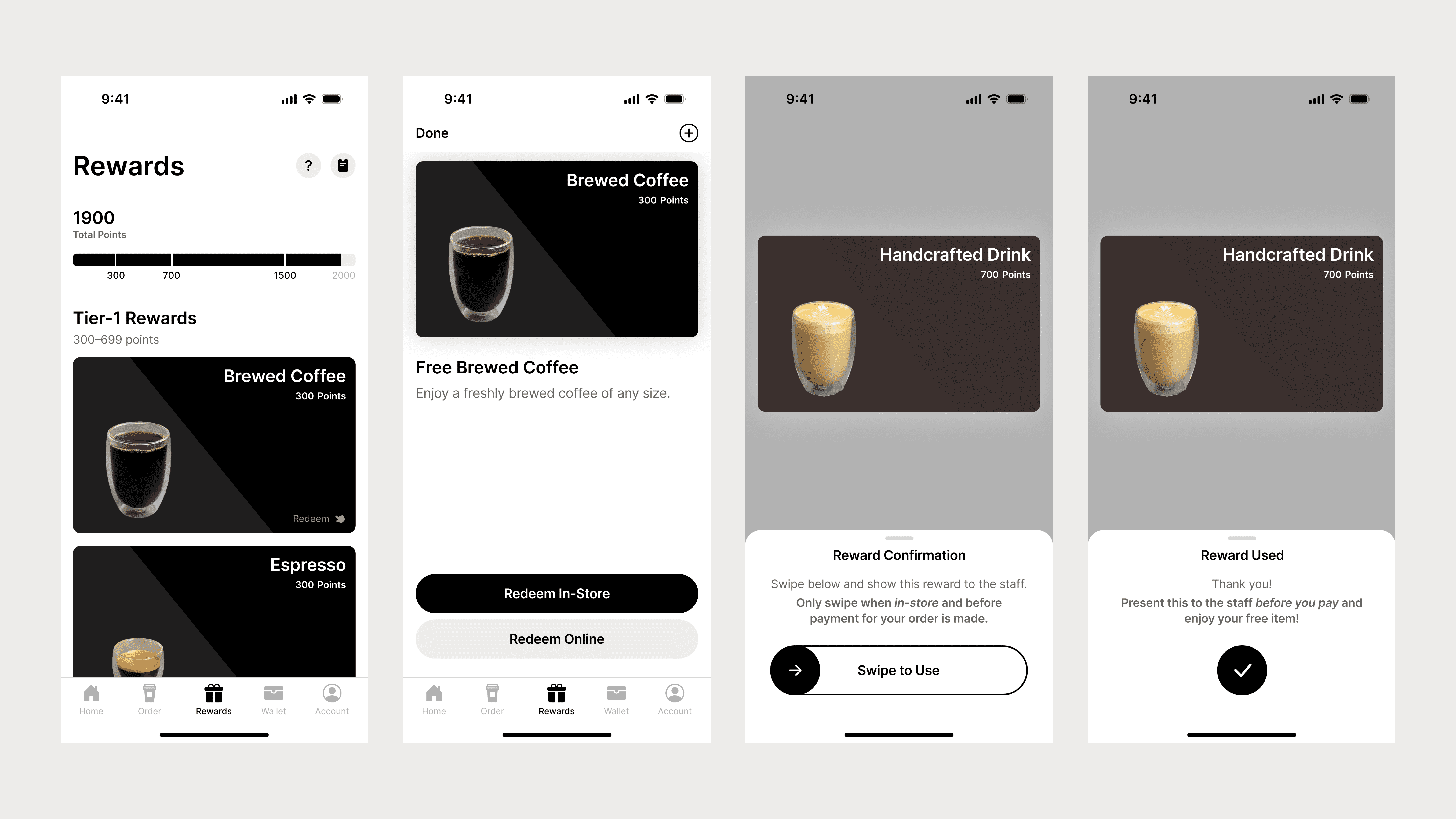
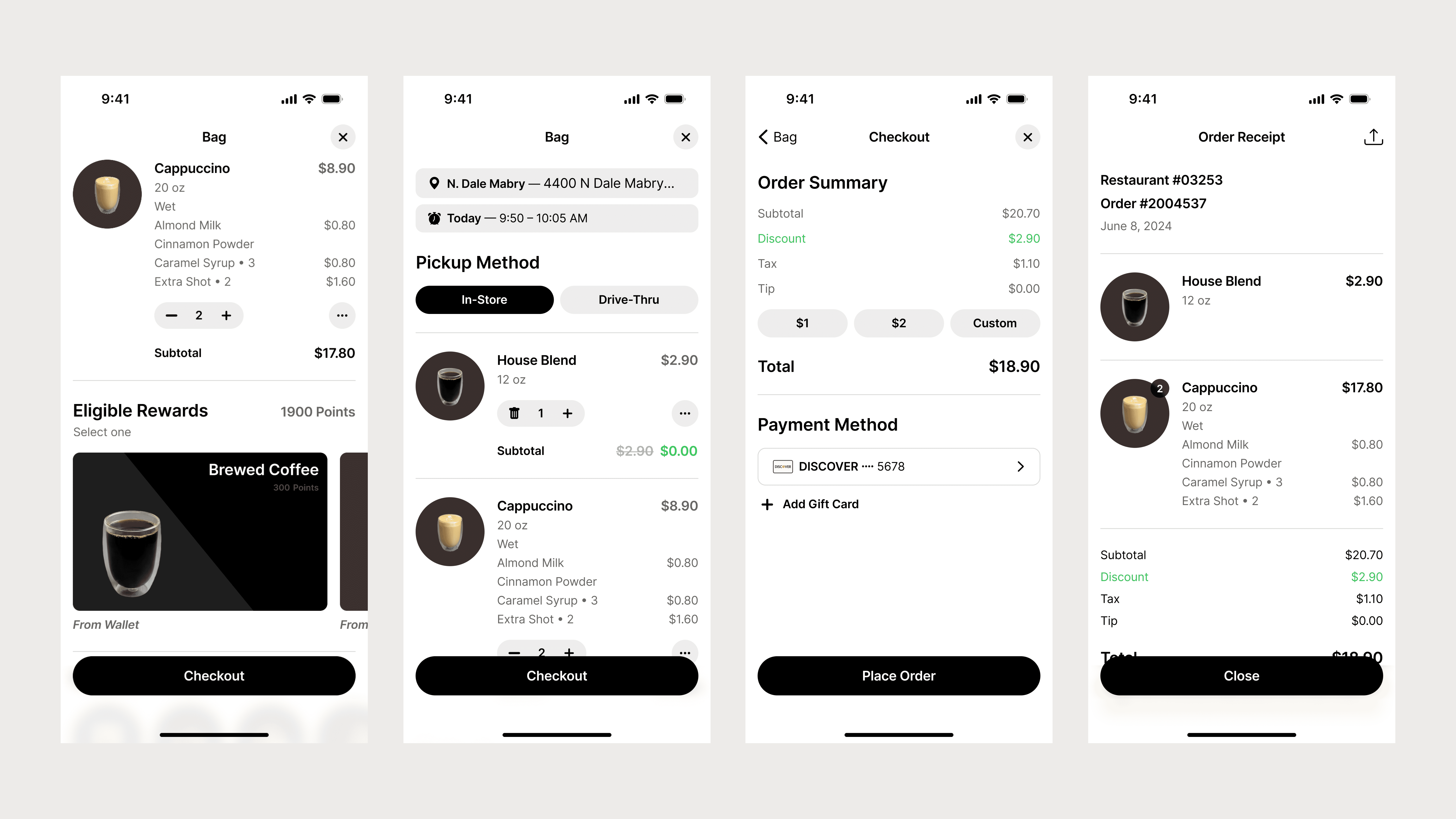
Rewards via mobile order
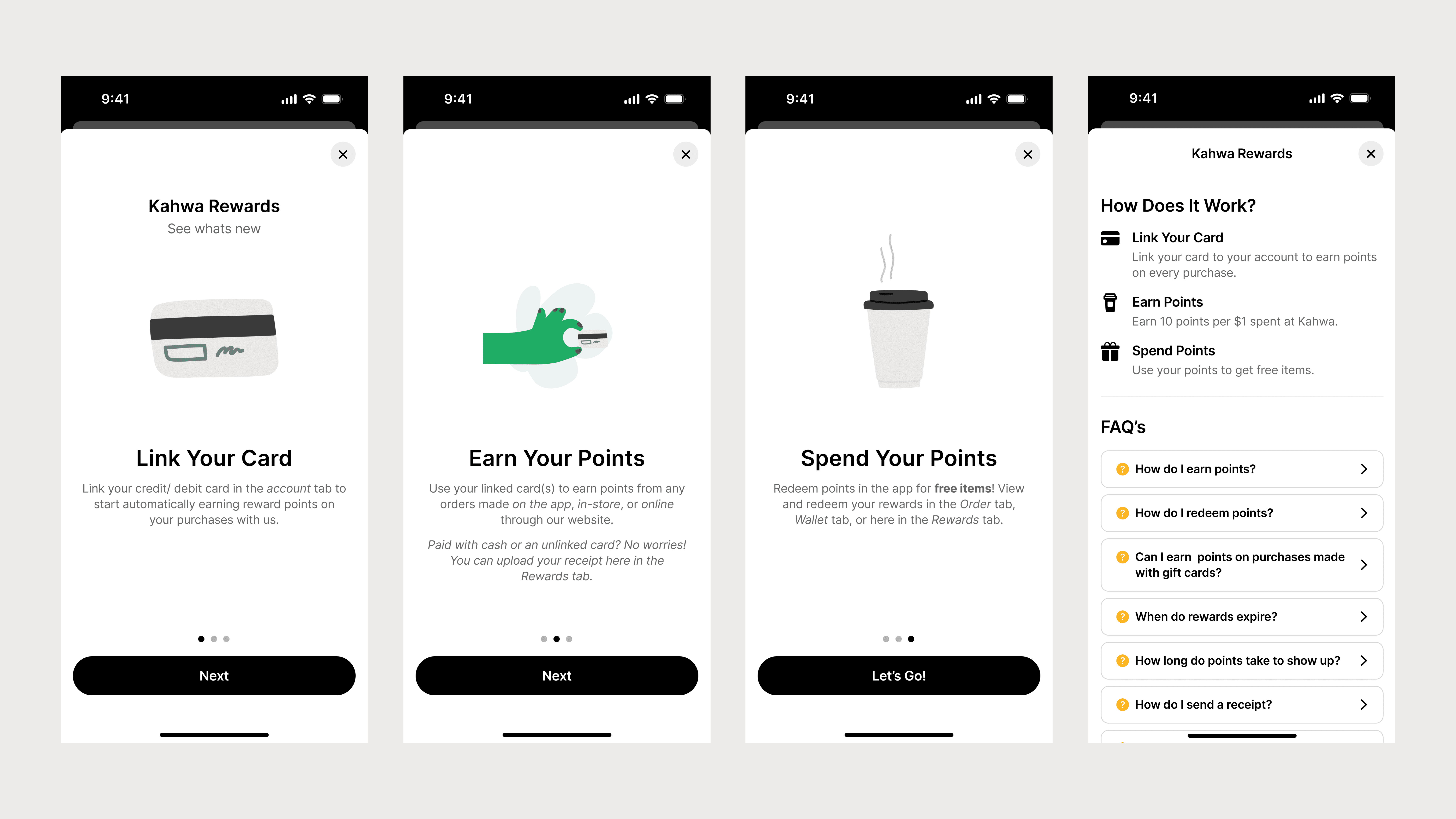
Onboarding + FAQ
Auxiliary screens
[CONTEXT]
Kahwa's fresh start
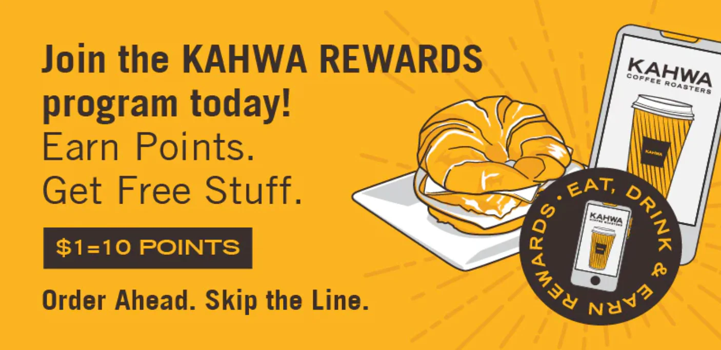
At the start of the new year, Kahwa updated its rewards program, enabling customers to earn points either by using a card linked to their account or by submitting a receipt for the order they wanted to earn points from.
However, this transition had not gone as smoothly as anticipated for all parties involved. As an employee during this time, other staff members and I received constant feedback from customers about how they'd felt about the new system.
Kahwa's promotional banner for rewards
[THE PROBLEM]
Poor communication of business changes affected how customers perceived them
The abruptness of Kahwa's reward changes caused friction for both customers and employees.
While customers sought explanations for the new system and employees did their best to provide them, both groups were essentially navigating the changes together, especially during the first few days.
[RESEARCH]
A disconnect between expectations and reality
Further guerrilla research was conducted over the course of ~5 weeks to examine how customers interacted with the rewards program in real time.
The resulting splits were:
[32%]
of customers were uninformed of the new rewards system
These individuals were unaware that the old system was changed—needing an explanation of the new process or simply disregarding the rewards program for their purchase.
[47%]
of customers did not understand the new rewards system
These individuals were aware that the system had changed, but still required assistance in navigating the app to reach desired outcomes.
[21%]
of customers understood the new rewards system
These individuals had an understanding of the new systems of the app and didn’t require assistance to reach desired outcomes.
Data compiled from a set of 37 customers
[FLOWS & JOURNEYS]
When and how do users interact with the product?
Understanding the situations where users commonly interacted with the app guided the design changes that would have to be made later on.
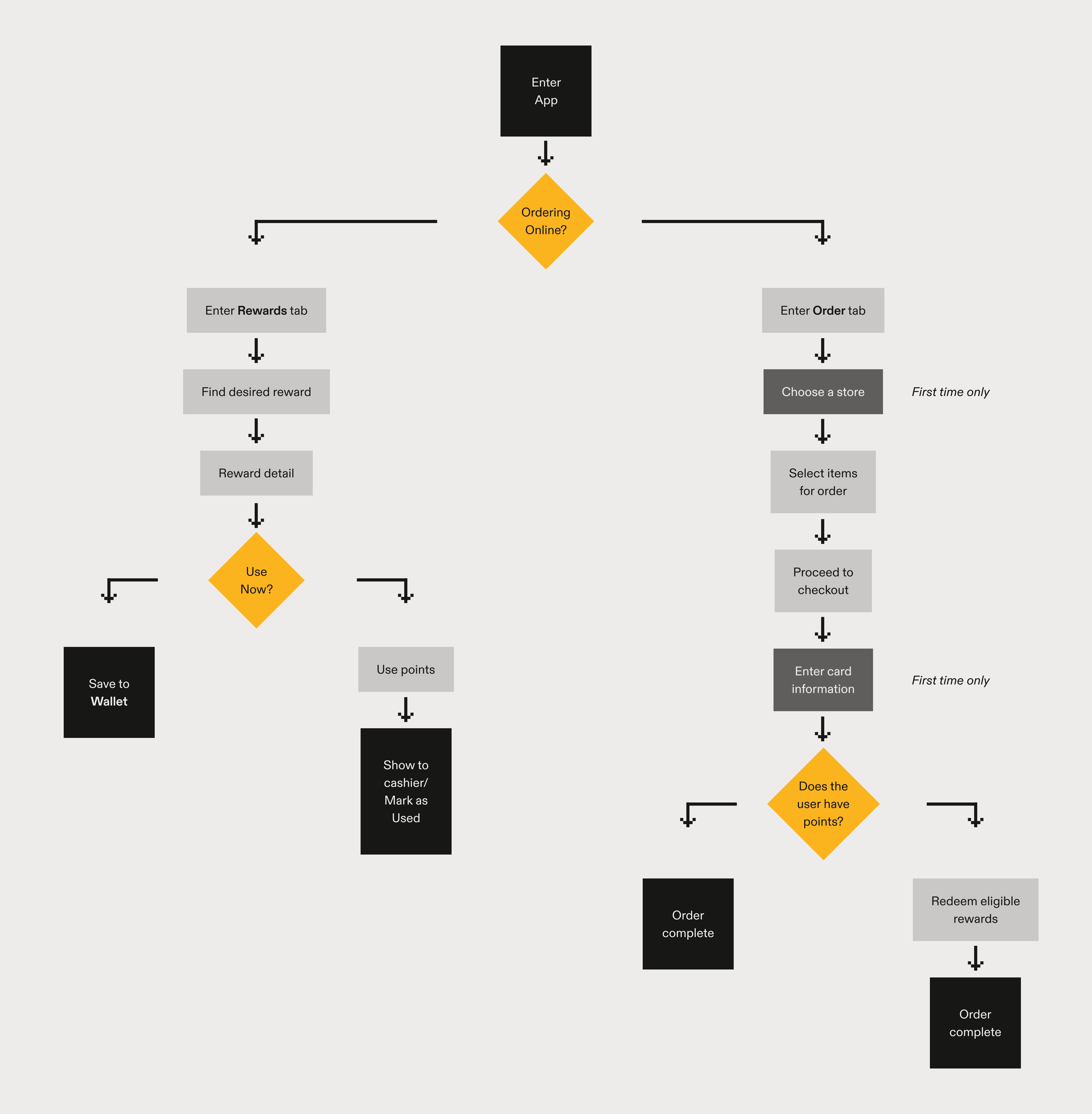
Given the nature of the company, the two places users needed to use this product were:
[1]
In-store/ Drive-thru
Customers open their app in line to look for the rewards they want to use for their order.
[2]
Online
Users place an order on the app and apply for eligible rewards prior to checkout.
Flowchart for in-store vs. online rewards
[COMPETITIVE ANALYSIS]
Looking at rewards programs across different cafes
A need to understand the market.
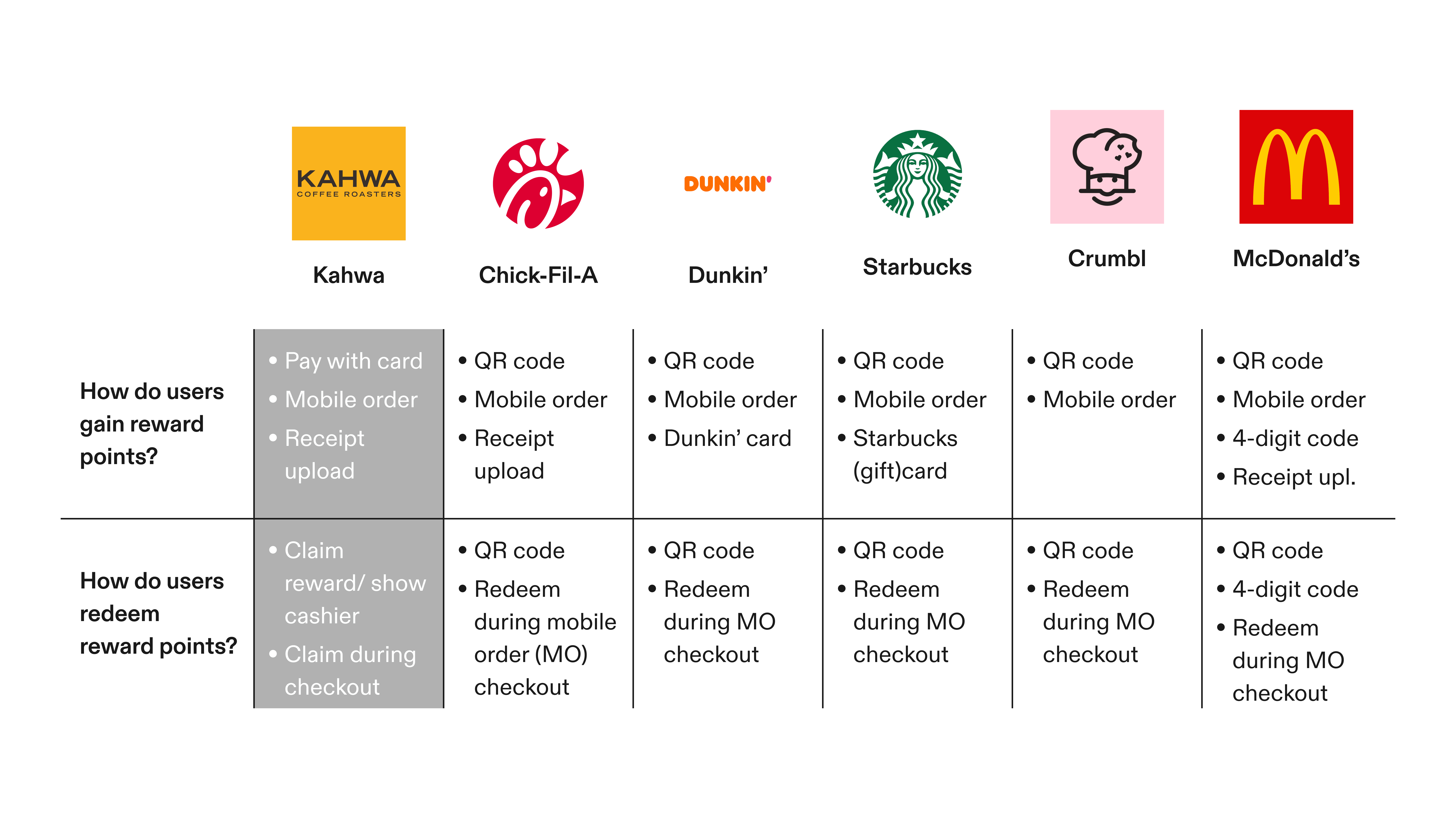
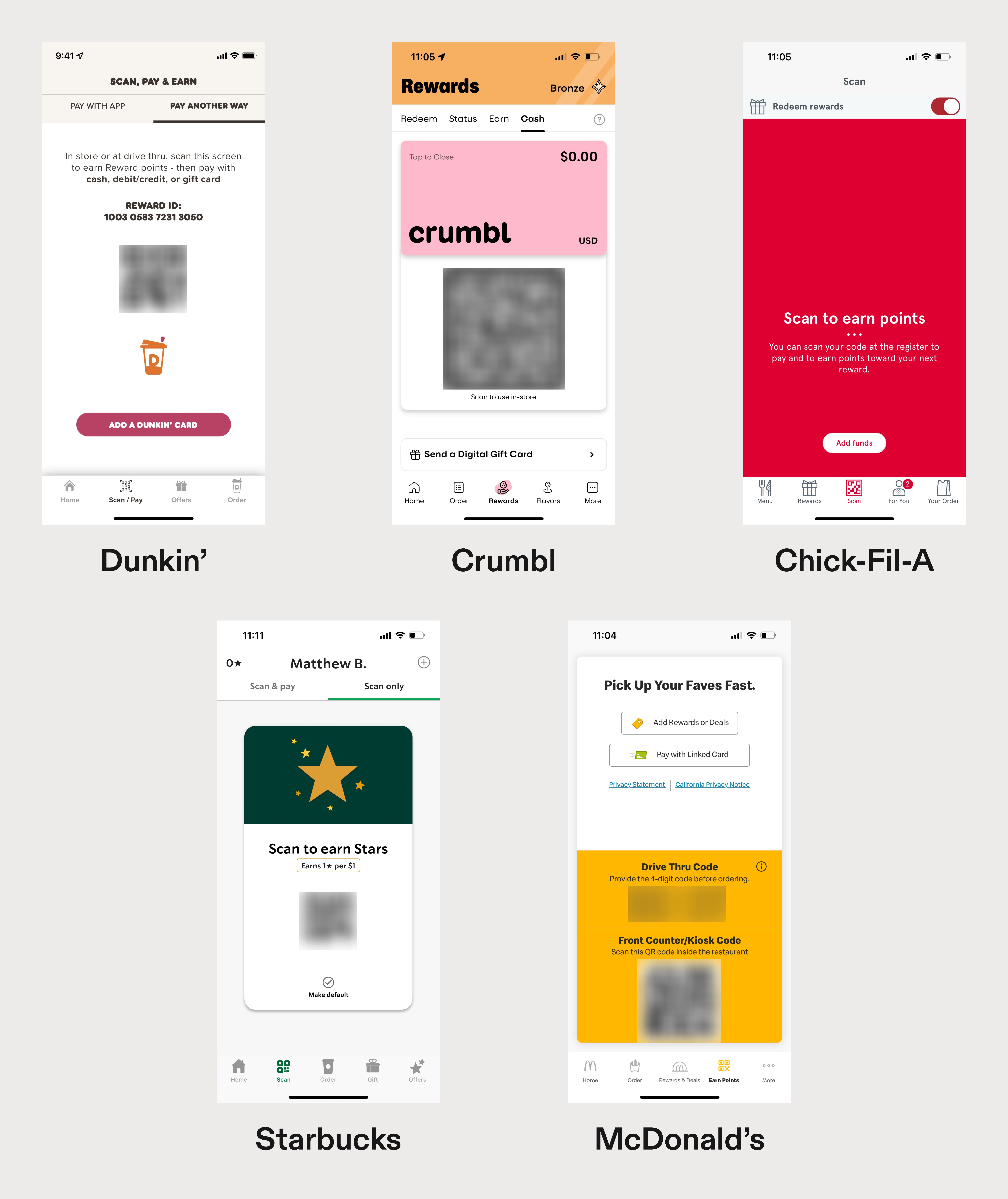
Kahwa’s competitors employ similar methods across all their apps respectively. They have users scan a QR code that dually functions as:
A way to earn reward points
Redeem the points earned
Why would Kahwa want to differ?
Competitive analysis chart
An attempt to distinguish themselves from their competitors
Given (what appears to be) the industry standard for reward systems, it was presumed that the driving motive behind these changes was to establish a change that made earning rewards slightly more efficient.
QR code functions across competitors
[PRODUCT AUDIT]
Assessing what was already there
Before moving to design explorations, a final audit was conducted to assess what areas of the app needed revision. This helped define notable heuristic and usability issues.
[▼]
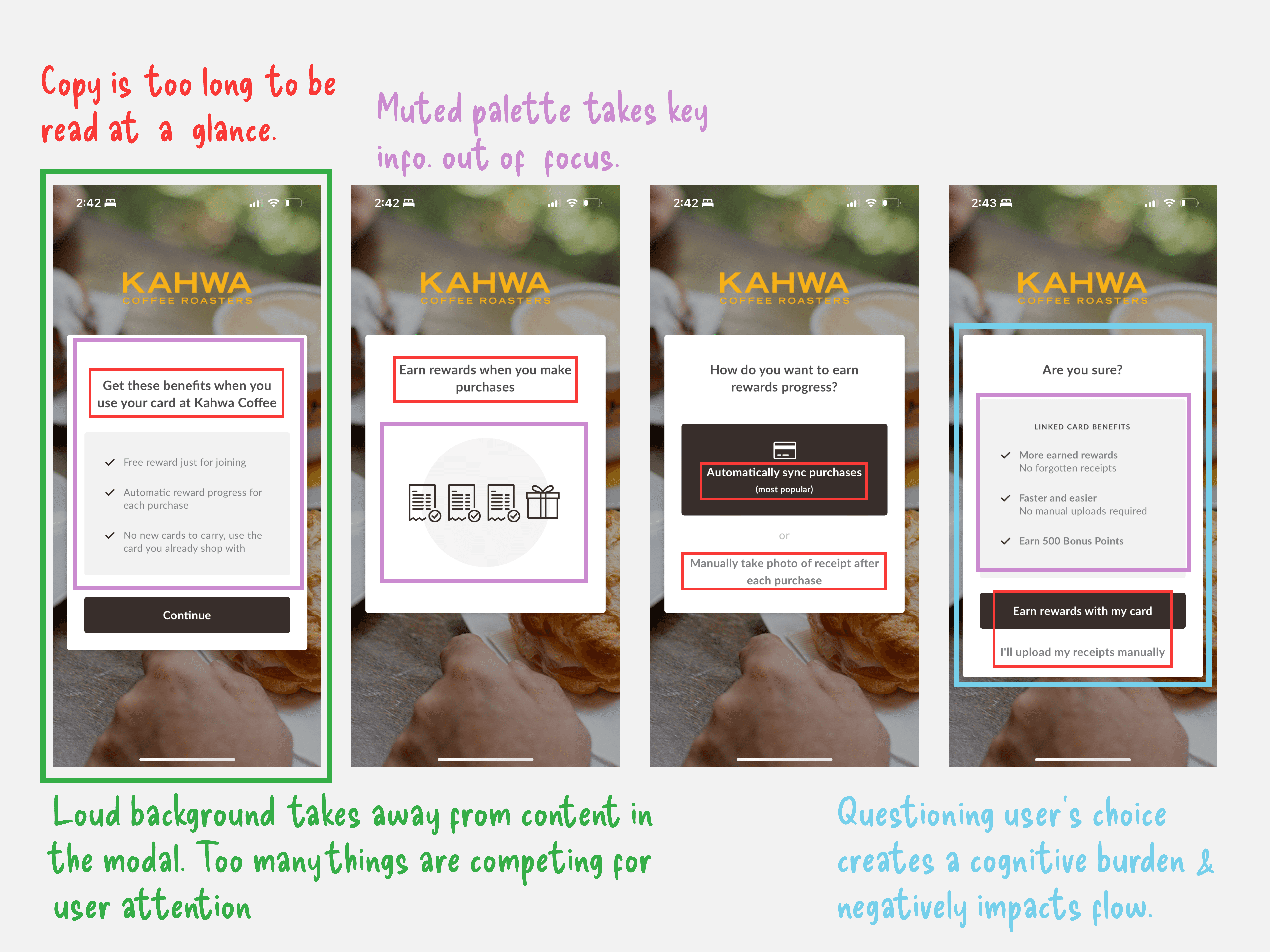
Poor onboarding process
A better channel of communication between Kahwa and their customers is essential for feature adoption.
Evaluation of existing onboarding screens
[▼]
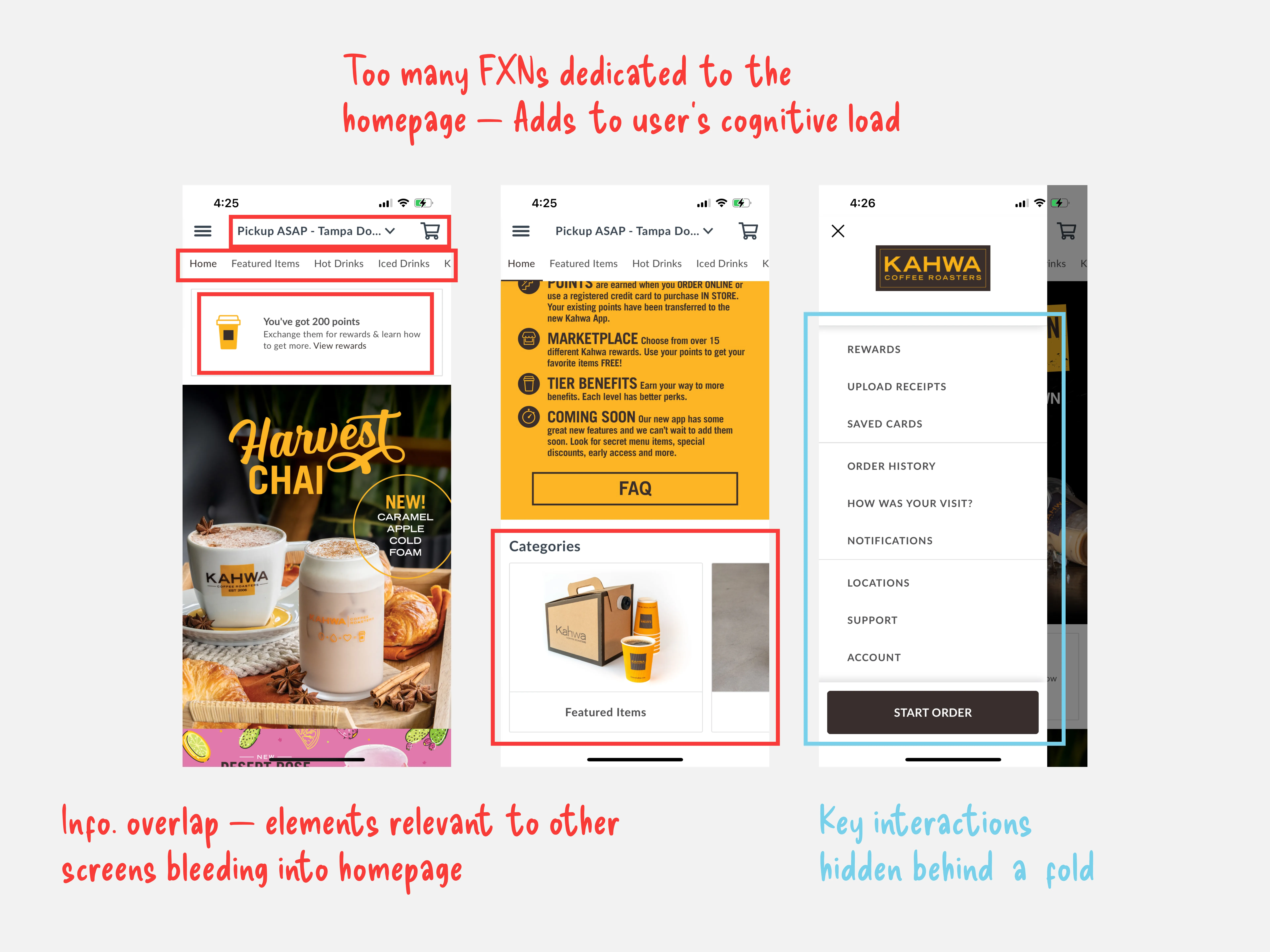
Poor information architecture
The placement of relevant information made it difficult to navigate through screens.
Evaluation of current IA
[▼]
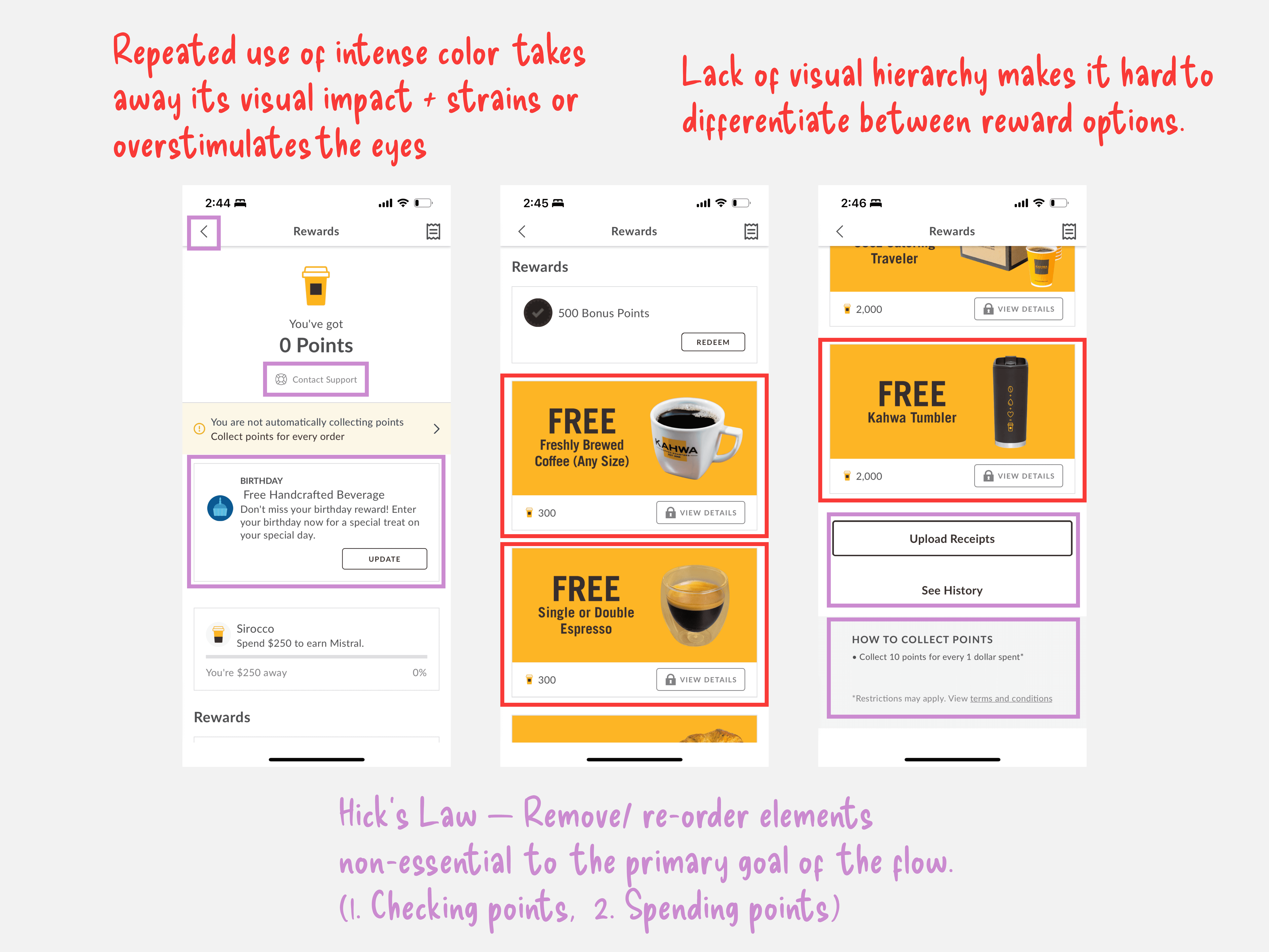
Poor scannability
Lacking color and typographical foundations, compounded with a poor IA, increased the time it took for users to discover target elements.
Evaluation of existing content hierarchy
More issues than expected
Realizing there were fundamental oversights of the app as a whole made it difficult to stay within the scope of the project. It was eventually decided that the homepage would be added to the list of tasks to complete.
This undertaking was to ensure that the general functionality of the app even allowed for users to reach the new rewards section.
[THE GOAL]
Take the existing system, and adjust it so that it feels intuitive and desirable enough for users to come back to.
Keys to success:
[1]
Clarity
Clean and efficient design.
[2]
Transparency
Provide guidance when users are lost.
[3]
Consistency
Exude product excellence through unity.
[HOMEPAGE]
It all starts at home
Try to do everything, and you’ll accomplish nothing.
The existing homepage gave users too many potential tasks to handle—functioning as a promotional page, menu, FAQ, location picker, and checkout all-in-one.
Changes were made to help progressively guide users to potential actions they’d want to take, rather than show it to them all at once.
New homepage promoting new products & deals
[REWARDS]
Minimal, scannable, and straight-forward
For those who are unaware.
As shown in the research, about a third of the company's users weren't aware of any changes being made.
To combat this, an update to their onboarding process was essential. Shown to all first-time users and available for others to return to if needed.
Initial onboarding flow + FAQ for callback when needed
For those in-store/ at a drive-thru.
In these environments, users were less likely to use the app if it took too long to access their rewards.
Speed is crucial in these cases, as users often didn't want to fumble with the app and risk holding up the line.
Changes were made here to make scanning through available rewards faster, and steps to using the rewards clearer.
New rewards screen segregated by color and tier/ value
Simplified flow for in-store reward redemption for users
For those ordering online.
Evaluating the efficacy of the current rewards system for online orders was difficult as there was no clear way to distinguish orders that came through the app and used a reward.
Changes were made purely based on the problems found in the audit—designing for more visual clarity and design consistency.
Mobile reward redemption process
[THE WALLET]
Find what you need, when you need it most
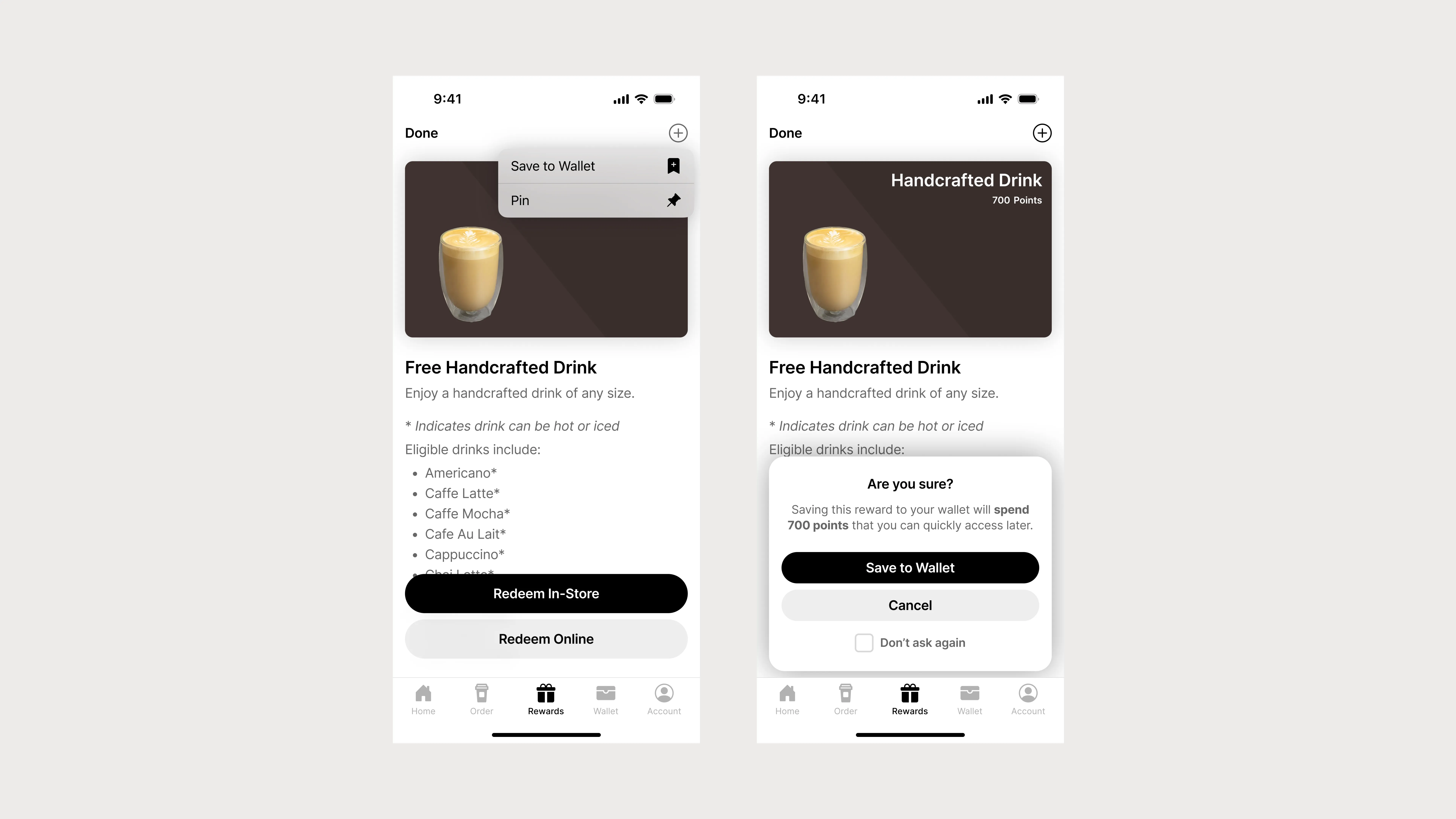
Users spent a lot of time trying to find rewards that they wanted. While the previous changes improve scannability, those looking to redeem points in advance can now save desired rewards in their wallet, streamlining the process even further.
Saving reward to wallet + confirmation modal
Wallet reward redemption flow + FAQ
[THE RESULT]
Speaking with the company
This case study was predicated on personal experiences and observations during my time spent within various Kahwa Coffee establishments. I understood that any chance for these features to be pushed for implementation, I’d have to get in contact with the company themselves—so I reached out to them and am still currently awaiting a response and potential feedback to the concepts shown here.
[RETROSPECTIVE]
Where do we go from here?
Going deeper in explorations.
The final solutions that were eventually arrived to are serviceable, safe, and ultimately functional for the ideas that Kahwa was trying to move forward with originally.
However, there are explorations (some more outlandish than others) such as NFC integration for reward cards that I would have to run by software engineers.
Flesh it all out.
I would like to go back and use dedicated prototyping softwares such as Origami or Play to fully flesh out these prototypes and micro-interactions that would bring these concepts to life even more than before.
Takeaways
Applying learnings to other work.
This was a personal exploration, but I still came away with some valuable insights for myself:
[*]
Be creative, but don't neglect logic
Constraints exist for every project, but the solutions found within them can still be liberating for the product.
[*]
Simplicity is not always simple
Removing elements isn't always the answer. What and why things are removed should always take precedent.
